TIMELINE
8 WEEKS
CLIENT:
DONUT
YEAR:
2023
ROLE:
PRODUCT DESIGN, USER RESEARCH
Donut Signup
Donut Signup
TL;DR
TL;DR
At Donut, I led product design across onboarding, internal tools, and engagement features for a Slack-based platform focused on team connection. One of my key contributions was redesigning the onboarding flow, which helped increase trial-to-paid conversion by 10% .
I also worked closely with PMs and engineers to ship a smart template-matching feature and improve dashboard usability. This role sharpened my skills in product-led growth, fast iteration, and designing within real-world technical constraints.

Context
Context
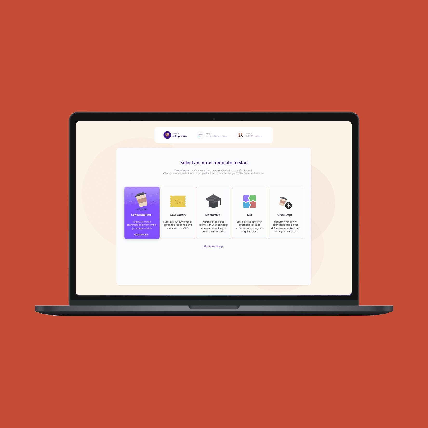
Donut began as a Slack plugin for onboarding new hires through automated check-ins. By 2021, the rise of remote work expanded their reach, and the product evolved into a suite of four tools: Intros, Watercooler, Celebrations, and Onboarding. Each was designed to foster connection, collaboration, and camaraderie.
The original onboarding flow was built for a single product. As the platform grew, it needed a more flexible and intuitive experience. This redesign simplified the process, leading to higher completion rates and increased product adoption.
Redesign Results
33% increase in multiple product installs/session
10% increase in trial starts
10% increase in trial-to-paid conversion
Redesign Results
33% increase in multiple product installs/session
10% increase in trial starts
10% increase in trial-to-paid conversion
Problem
Problem
Analysis of usage and business data revealed a key insight: 80% of teams using Donut were not paying customers.
Working with our data scientist, we discovered that paying teams consistently used more than one Donut product. This raised two critical questions:
How does multi-product usage impact conversion?
What’s preventing the majority of teams from adopting more than one product?
User Research Methods
User Research Methods
To explore these questions, our team aligned on a dual approach: conducting qualitative interviews alongside usability tests. The map below outlines the strategy we used to guide this research.
To explore these questions, our team aligned on a dual approach: conducting qualitative interviews alongside usability tests. The map below outlines the strategy we used to guide this research.

Challenge
Challenge
Finding the right people to interview was a huge challenge. Who do we recruit and how do we find them? We were looking for 3 specific types:
Group 1: Teams who installed Donut and became paying customers, to understand what drove conversion.
Group 2: Teams using only one Donut product, to explore barriers to multi-product adoption.
Group 3: New users preparing to install Donut for the first time, to gather fresh feedback on the current onboarding experience.
Recruiting Interviewees
Recruiting Interviewees
Intercepting installers
Finding the right participants required a bit of ingenuity. We started by emailing current Donut admins a screener survey, filtering for those who had personally installed Donut in their Slack workspace. Qualified respondents were offered financial incentives to join our research sessions.
But the real breakthrough came from targeting first-time users in real time. Since observing fresh users was critical for understanding why some teams only installed one product, we used Intercom to identify new visitors who had just initiated the installation flow. Then, right in the moment, we intercepted them through Intercom’s chat and invited them to join a usability study in exchange for a reward.
This tactic worked surprisingly well. By catching users at the exact point of entry, we were able to recruit high-quality participants who gave us rich insights into their first impressions and decision-making process.
Discovery + Deeper Insights
Discovery + Deeper Insights
After 20 interviews and 15 usability tests, we began to uncover a clear relationship between multi-product usage and customer conversion.
1. Different people connect in different ways
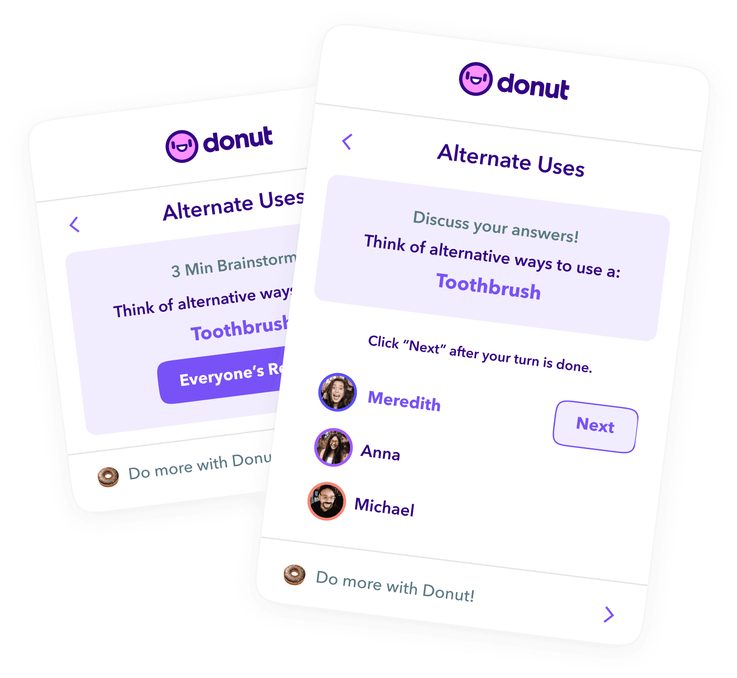
Teams often found that not every Donut product fit their culture, but having options mattered. For example, extroverted teams gravitated toward Intros (video-based), while more introverted teams preferred Watercooler (chat-based). This flexibility made it more likely that multiple products would get adopted within a single workspace.
2. More products = more billable users
Because Donut’s pricing is per user, the more teammates engaging with different products, the more likely a team is to exceed the free tier and convert to paid. Multi-product use effectively increased the "surface area" for monetization.
3. Most users didn’t know all the products existed
A surprising number of participants were only aware of one Donut feature. When shown a page listing all available products, many said it was their first time seeing it. This likely contributed to low conversion rates; people simply didn’t know what else they could use.
4. Exposure drives conversion
We learned that 10% of teams trying a paid product eventually convert. This stat reframed our goal: instead of pushing conversion directly, we needed to increase meaningful exposure to more products during onboarding and early use.
5. Automation is a major selling point
For roles focused on workplace culture, Donut saved hours of manual coordination. For them, the value was clear, and paying for Donut was an easy decision.
After 20 interviews and 15 usability tests, we began to uncover a clear relationship between multi-product usage and customer conversion.
1. Different people connect in different ways
Teams often found that not every Donut product fit their culture, but having options mattered. For example, extroverted teams gravitated toward Intros (video-based), while more introverted teams preferred Watercooler (chat-based). This flexibility made it more likely that multiple products would get adopted within a single workspace.
2. More products = more billable users
Because Donut’s pricing is per user, the more teammates engaging with different products, the more likely a team is to exceed the free tier and convert to paid. Multi-product use effectively increased the "surface area" for monetization.
3. Most users didn’t know all the products existed
A surprising number of participants were only aware of one Donut feature. When shown a page listing all available products, many said it was their first time seeing it. This likely contributed to low conversion rates; people simply didn’t know what else they could use.
4. Exposure drives conversion
We learned that 10% of teams trying a paid product eventually convert. This stat reframed our goal: instead of pushing conversion directly, we needed to increase meaningful exposure to more products during onboarding and early use.
5. Automation is a major selling point
For roles focused on workplace culture, Donut saved hours of manual coordination. For them, the value was clear, and paying for Donut was an easy decision.
Usability Study Findings
Usability Study Findings
The second objective of our research was to uncover why 80% of users were only engaging with a single Donut product.
An audit of the existing onboarding flow revealed a potential culprit: the experience lacked clarity and visibility around Donut’s full range of offerings. I hypothesized that this gap in communication was limiting multi-product adoption.
To explore this, I conducted a usability study with first-time users actively looking to install Donut. By observing how they navigated the onboarding experience, we were able to identify friction points and missed opportunities to surface value early.
Below are several usability issues that likely contributed to drop-off and limited product adoption:
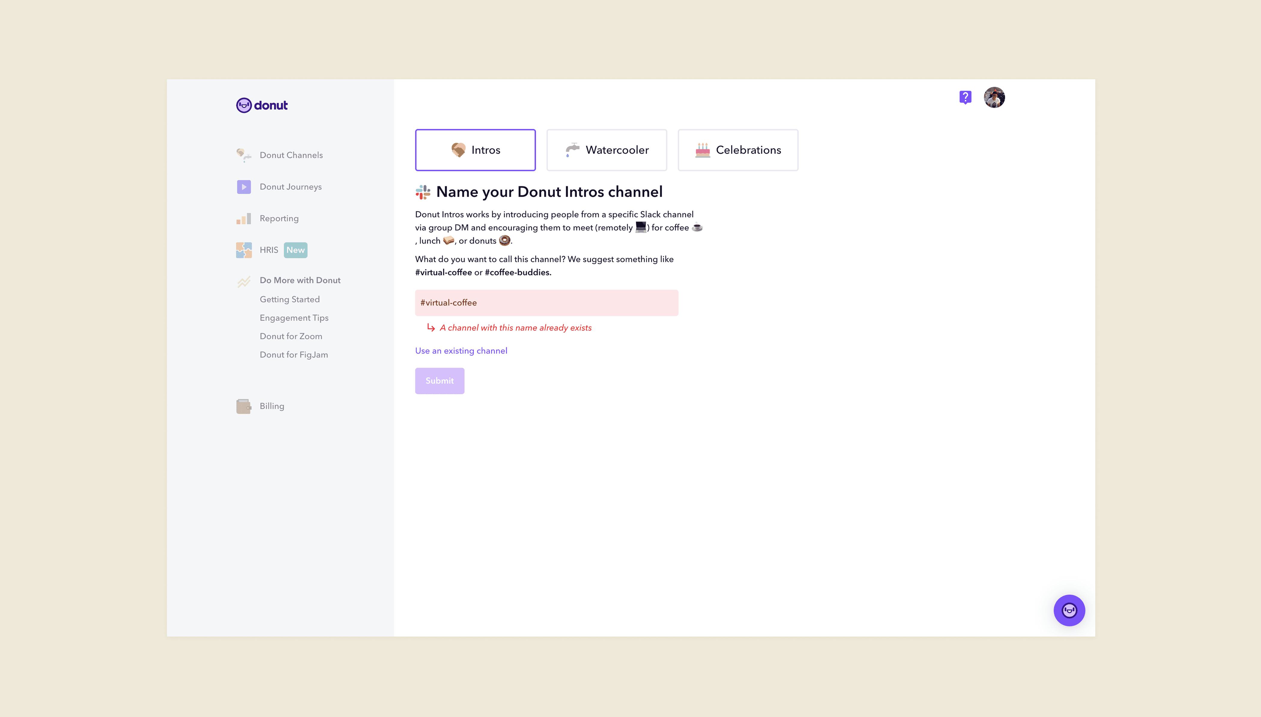
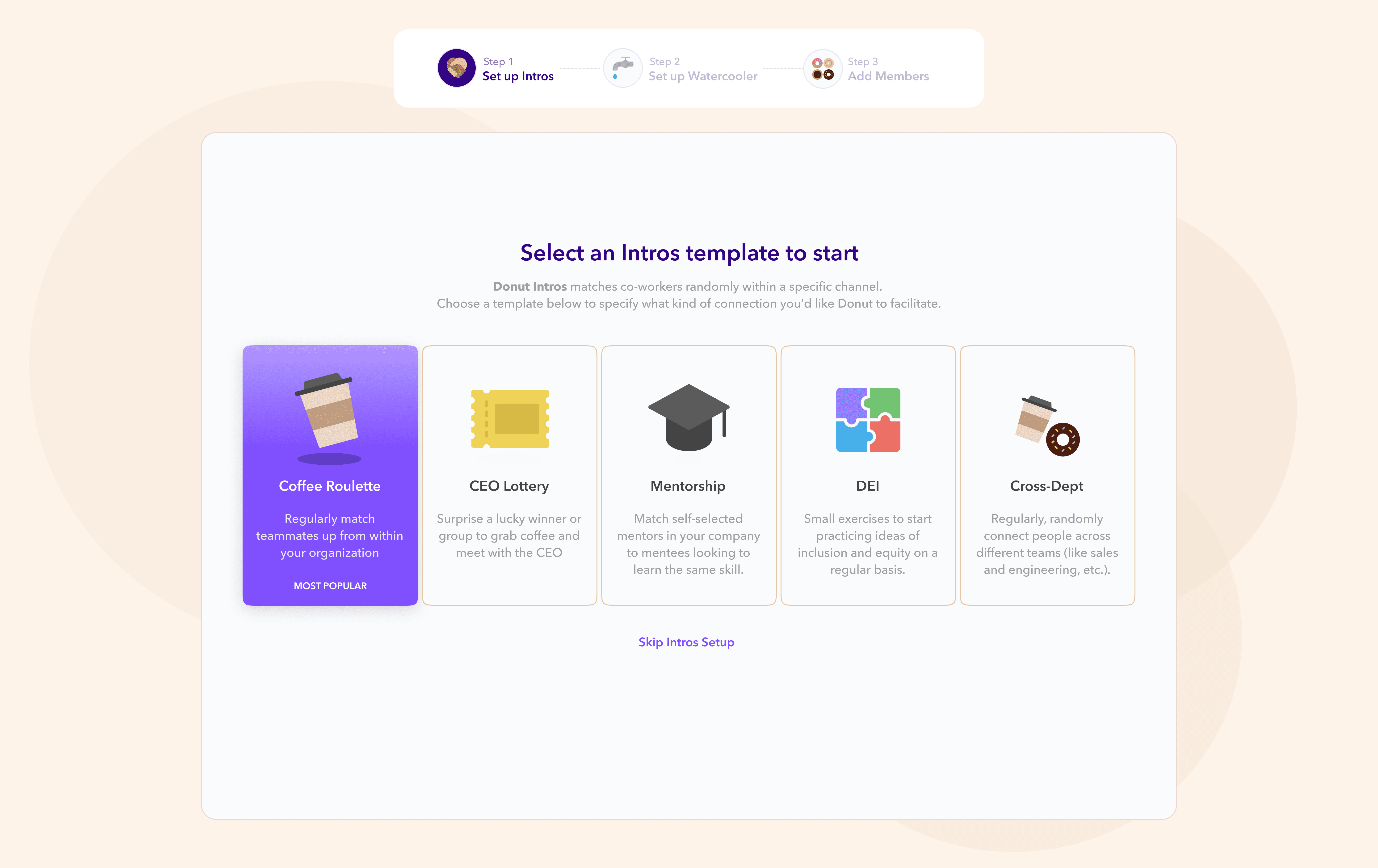
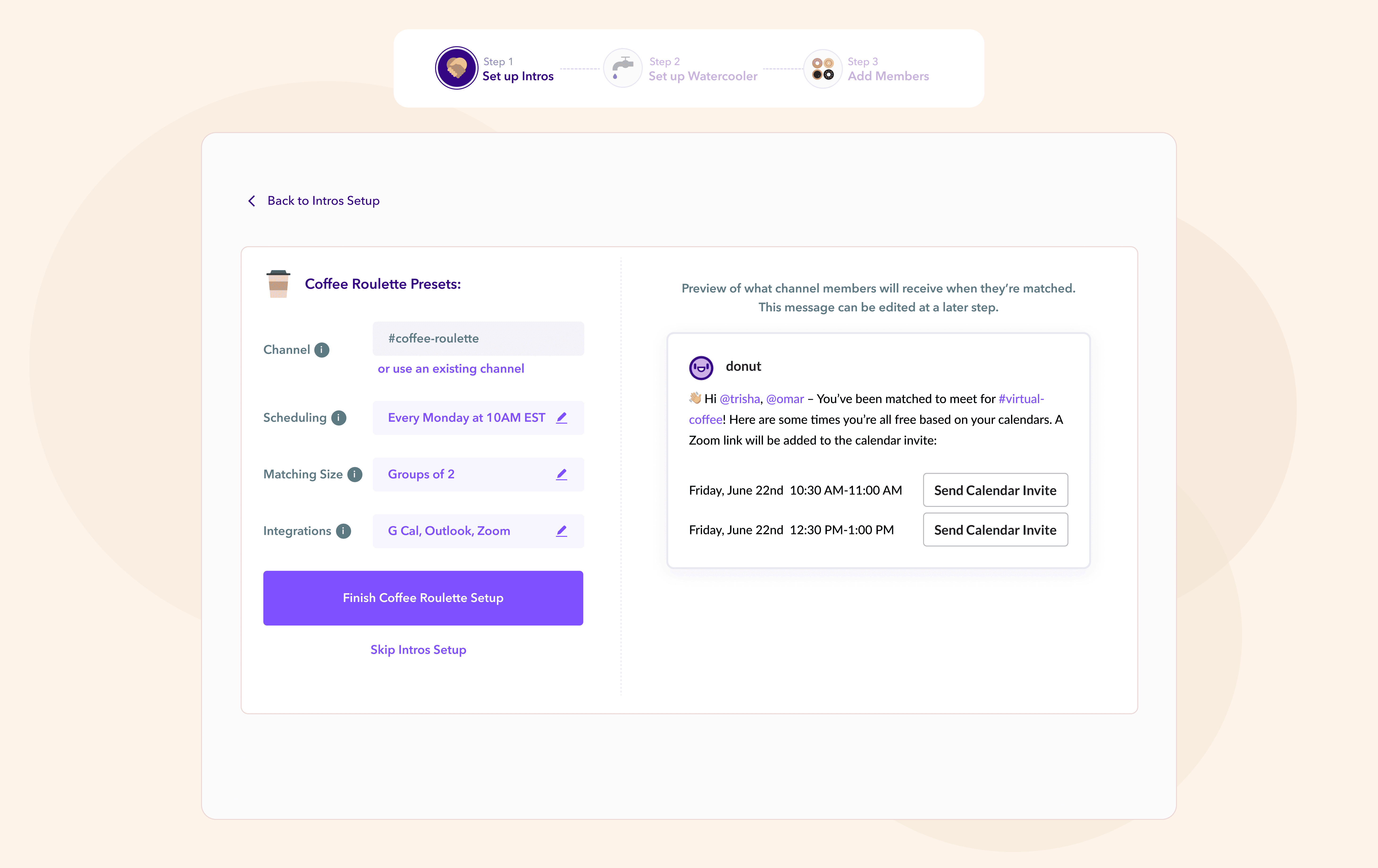
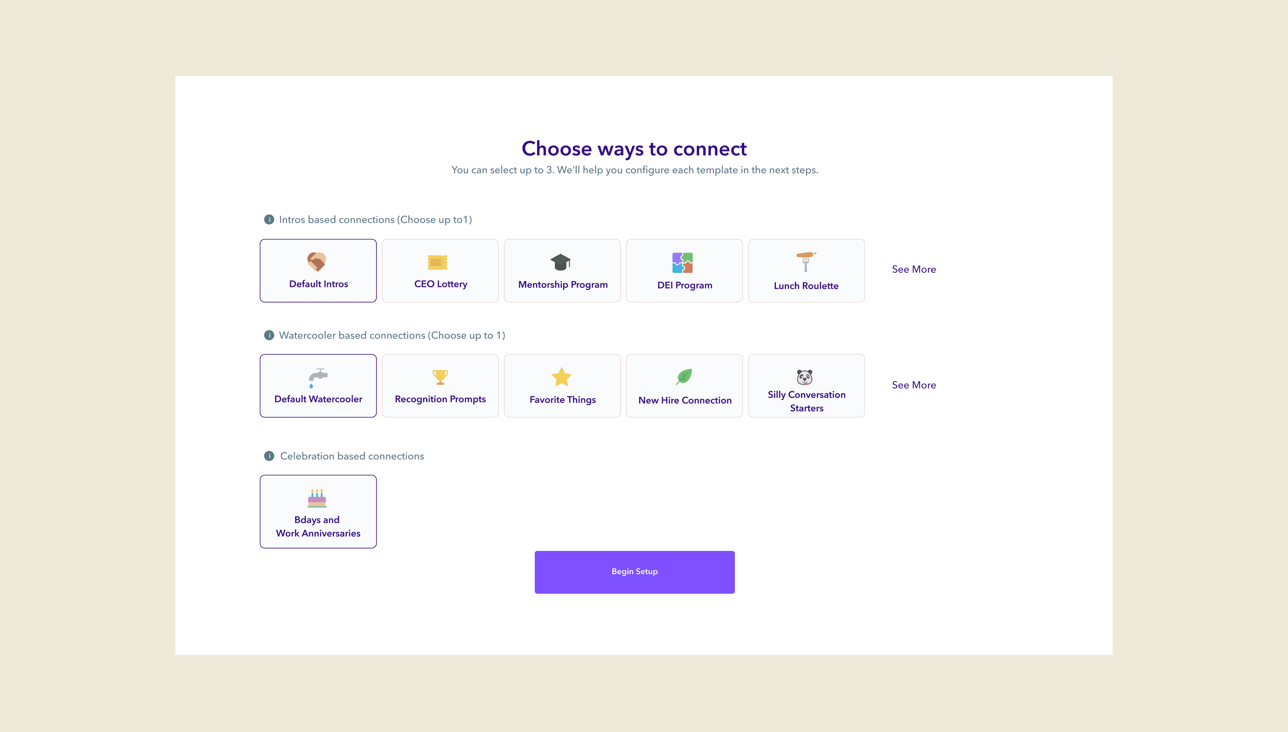
⚠️ Tabbed Selection
Donut’s install page forced an installer down only one product path.
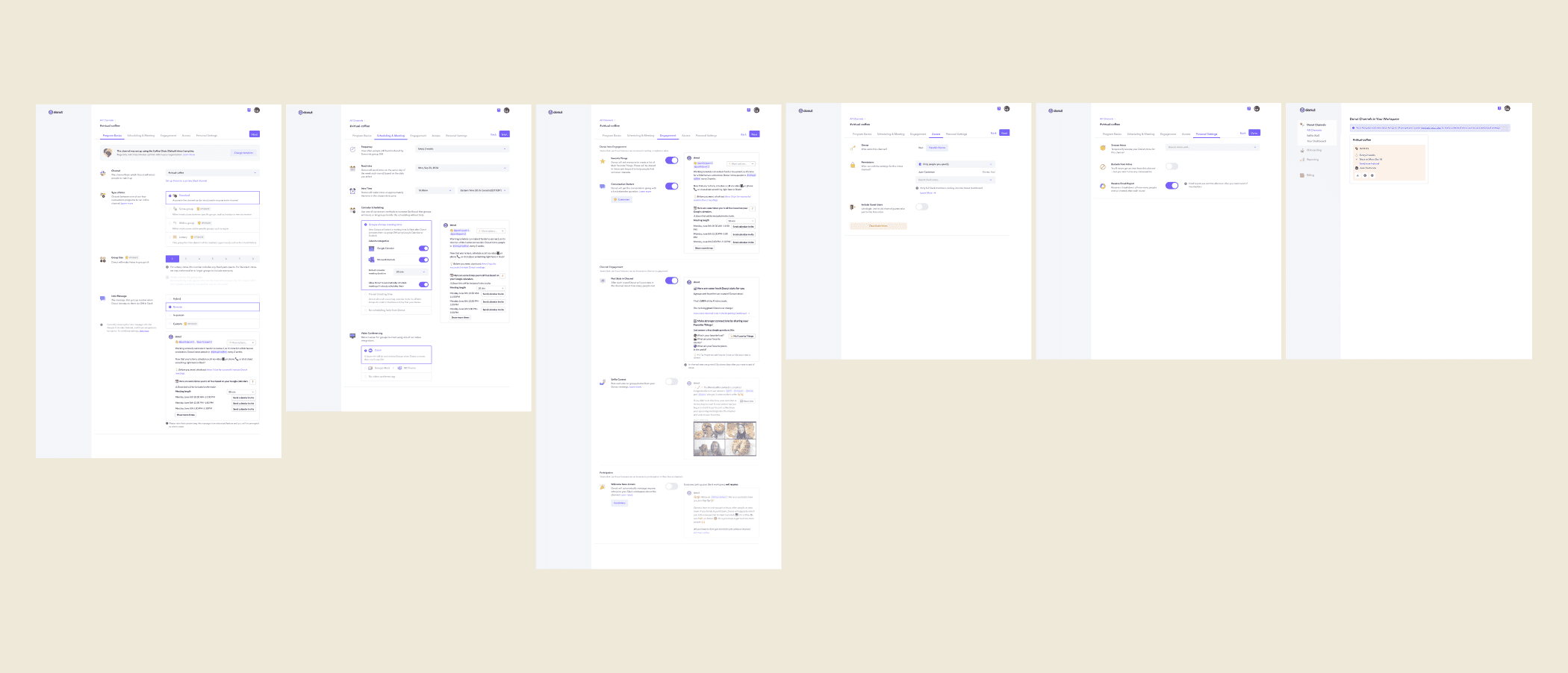
⚠️ Lengthy Onboarding
Donut's sign up flow has about 18 steps split into 7 tabs. Analytics showed that about 50% of installers drop off by the 2nd tab, missing out on customizing Donut for their team to have the best experience.
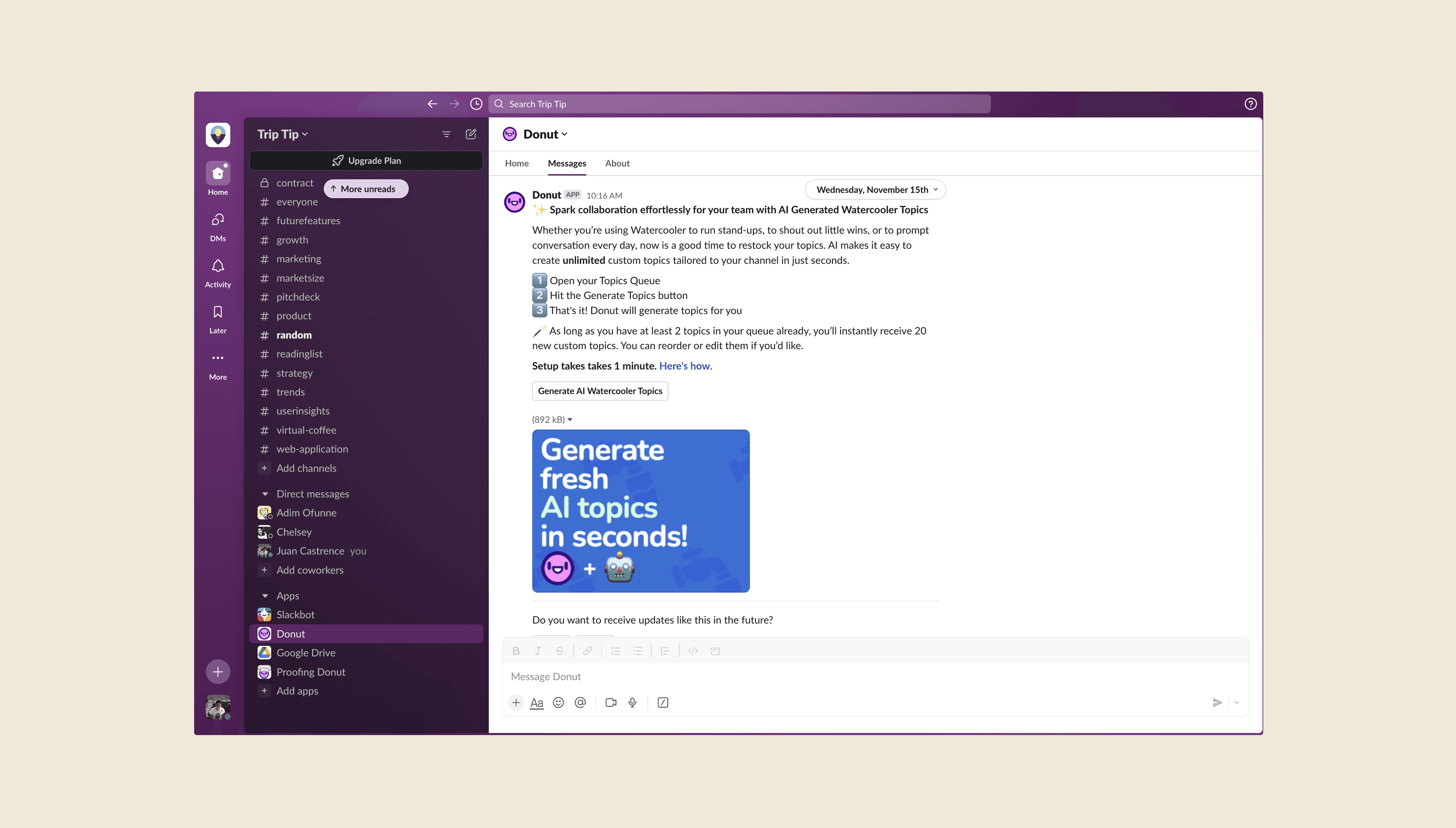
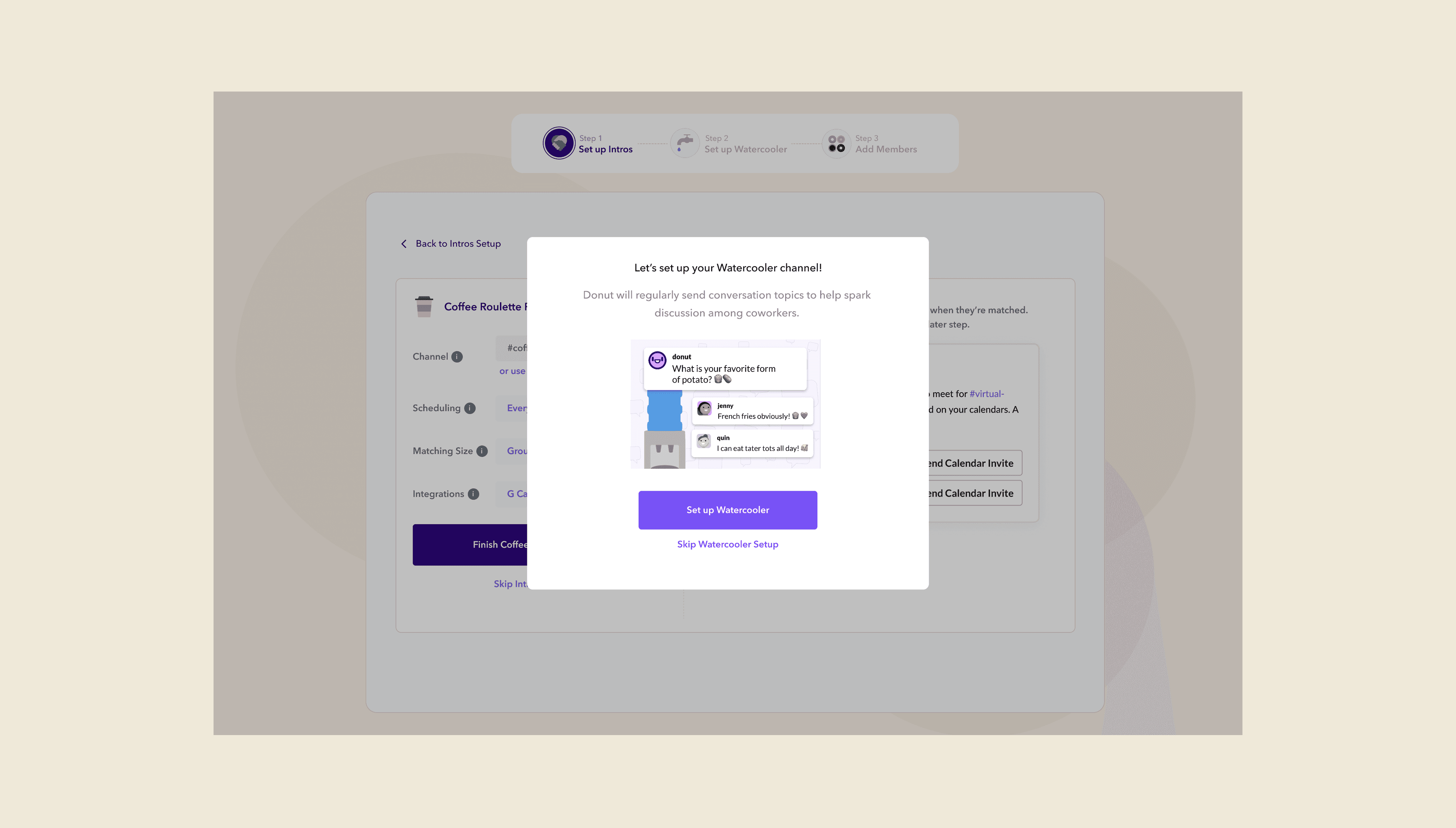
⚠️ Disjointed flow and steps that got ignored
Donut DMs installers 24 hours after installation to promote other products like Watercooler and Celebrations or to add members to the newly created channels.
Our qualitative interviews that these DMs are often missed, leaving these crucial onboarding steps abandoned and forgotten.
Donut DMs installers 24 hours after installation to promote other products like Watercooler and Celebrations or to add members to the newly created channels. We found out through our qualitative interviews that these DMs are often missed, leaving these crucial steps abandoned and forgotten.
⚠️ Tabbed Selection
Donut’s install page forced an installer down one product path. a user can select a product by clicking on a tab.
⚠️ Lengthy Onboarding
Donut's sign up flow has about 18 steps split into 7 tabs. Analytics showed that about 50% of installers drop off by the 2nd tab, missing out on customizing Donut for their team to have the best experience.
⚠️ Disjointed flow and steps
that got ignored
Donut DMs installers 24 hours after installation to promote other products like Watercooler and Celebrations or to add members to the newly created channels.
We found out through our qualitative interviews that these DMs are often missed, leaving crucial onboarding steps abandoned and forgotten.
Hypothesis
Hypothesis
If users are introduced to all of Donut’s core products during the installation flow through a clear, streamlined, intuitive experience, then the rate of multi-product adoption per team will increase, and in turn, raise Donut's bottom line.
We now have 2 new guiding insights:
1. That different people prefer different modes of connecting with their company, and
2. That first time installers aren’t fully aware of Donut’s full suite of offerings.
We now have 2 new guiding insights:
1. That different people prefer different modes of connecting with their company, and
2. That first time installers aren’t fully aware of Donut’s full suite of offerings.
Leading Ideation Workshops
Leading Ideation Workshops
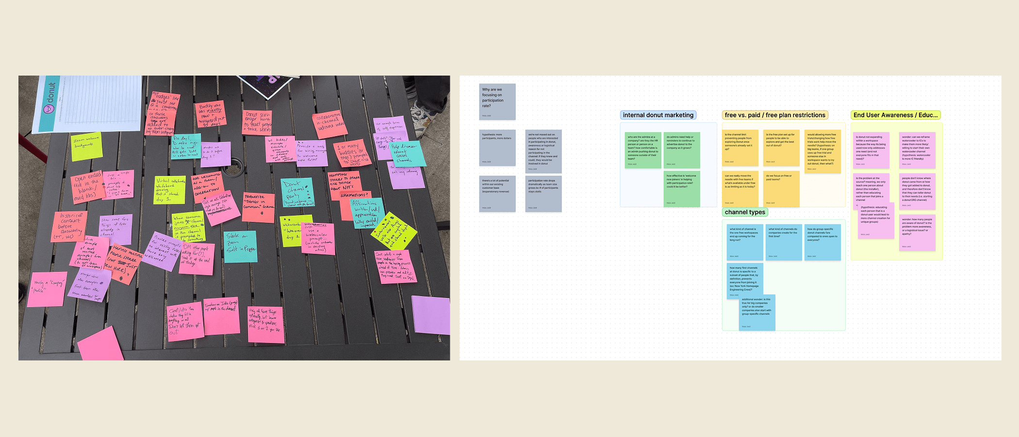
With new insights and a refined hypothesis, I partnered with PMs to lead a cross-functional design workshop aimed at getting different perspectives and aligning the team around the onboarding redesign.
A core value of mine is getting a diverse group of people in the room to solve problems together. Great ideas come from varied perspectives, so we brought in stakeholders from across the company, from engineering, product, customer success, and to marketing, to contribute to the conversation early.
To kick things off, we asked participants to share their favorite onboarding experiences from other apps. This helped ground our thinking in real-world inspiration and surfaced patterns around what made those experiences intuitive, delightful, or memorable.
I then reframed our challenge as a “How Might We” question:
“How might we encourage teams to install multiple Donut products during onboarding?”
From there, I facilitated rapid sketching exercises designed to pull ideas out of everyone, regardless of role or design experience. We wrapped with a group critique and dot voting, not to choose a single winner, but to identify ideas that sparked energy, alignment, and further exploration.
The workshop didn’t just generate great ideas, it fostered shared ownership and excitement while eliminating blind spots. It gave the team a common language and direction to move forward with confidence and clarity.
With new insights and a refined hypothesis, I partnered with PMs to lead a cross-functional design workshop aimed at getting different perspectives and aligning the team around the onboarding redesign.
A core value of mine is getting a diverse group of people in the room to solve problems together. Great ideas come from varied perspectives, so we brought in stakeholders from across the company, from engineering, product, customer success, and to marketing, to contribute to the conversation early.
To kick things off, we asked participants to share their favorite onboarding experiences from other apps. This helped ground our thinking in real-world inspiration and surfaced patterns around what made those experiences intuitive, delightful, or memorable.
I then reframed our challenge as a “How Might We” question: “How might we encourage teams to install multiple Donut products during onboarding?”
From there, I facilitated rapid sketching exercises designed to pull ideas out of everyone, regardless of role or design experience. We wrapped with a group critique and dot voting, not to choose a single winner, but to identify ideas that sparked energy, alignment, and further exploration.
The workshop didn’t just generate great ideas, it fostered shared ownership and excitement while eliminating blind spots. It gave the team a common language and direction to move forward with confidence and clarity.
Design Imperatives
Design Imperatives
Building on what we learned from usability testing and user interviews, I defined a set of design imperatives to guide the new onboarding experience. These were aimed at addressing friction in the current flow, while testing our hypothesis: that teams who adopt multiple Donut products are significantly more likely to convert to paying customers. Here’s what shaped the redesign:
Show value early
Surface Donut’s benefits within the first few steps to create momentum and buy-in.
Highlight breadth
Make the full product suite visible and understandable up front to encourage multi-product installs.
Limit reliance on Slack DMs
Avoid channels that users tend to overlook or miss entirely.
Automate setup where possible
Reduce manual effort to help teams get started faster.
Prioritize clarity over minimalism
Keep things simple, but not at the cost of understanding.
Maintain ease
Keep the low-friction install experience that made the original flow successful.
Each of these principles kept us focused on designing an experience that was not just smoother, but smarter and more aligned with both user needs and business outcomes.
Building on what we learned from usability testing and user interviews, I defined a set of design imperatives to guide the new onboarding experience. These were aimed at addressing friction in the current flow, while testing our hypothesis: that teams who adopt multiple Donut products are significantly more likely to convert to paying customers. Here’s what shaped the redesign:
Show value early
Surface Donut’s benefits within the first few steps to create momentum and buy-in.Highlight breadth
Make the full product suite visible and understandable up front to encourage multi-product installs.Limit reliance on Slack DMs
Avoid channels that users tend to overlook or miss entirely.Automate setup where possible
Reduce manual effort to help teams get started faster.Prioritize clarity over minimalism
Keep things simple, but not at the cost of understanding.Maintain ease
Keep the low-friction install experience that made the original flow successful.
Each of these principles kept us focused on designing an experience that was not just smoother, but smarter and more aligned with both user needs and business outcomes.
Sign Up Flow Redesign
Sign Up Flow Redesign
Instead of relying on follow-up Slack DMs, which often go unnoticed, we redesigned the onboarding flow to showcase Donut’s core products up front.
This ensured that users saw the full value of the platform while they were most engaged.
We also introduced Donut’s premium templates early in the flow. By triggering the two-week trial sooner, teams could experience some of Donut’s most compelling “aha” moments earlier in their journey, creating a stronger path to conversion.
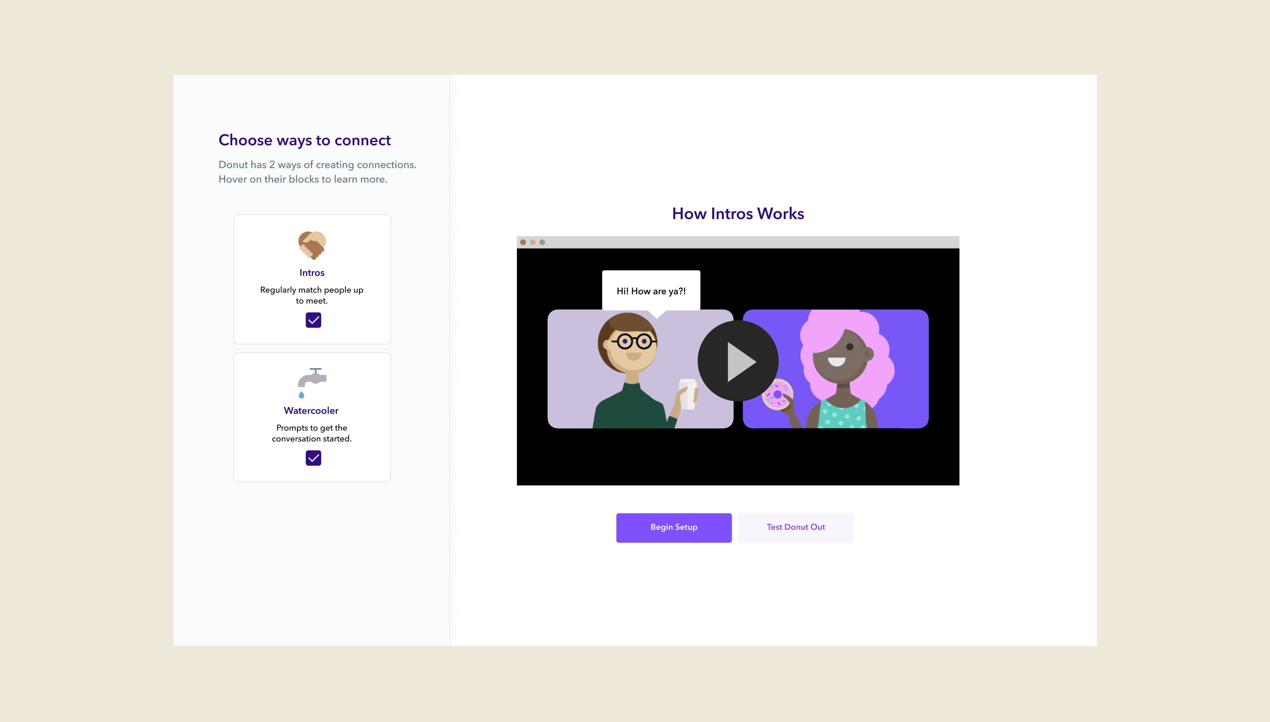
Old Design: Simple
Old Design: Simple
New Design: Clear
New Design: Clear
2
3
1
2
3
1
Old Design: Detailed
Old Design: Detailed
New Design: Distilled
New Design: Distilled
4
4
Old Design: Disjointed–users needed to go to Slack to finish the set up process.
Old Design: Disjointed–users needed to go to Slack to finish the set up process.
New Design: Streamlined–installing all Donut products happen within the same flow.
New Design: Streamlined–installing all Donut products happen within the same flow.
Alternative Directions
Alternative Directions
Here are a couple of other directions the team explored before we landed on our final design
Here are a couple of other directions the team explored before we landed on our final design
Alternative Design 1: Focus on explainers, since we felt that users were still confused by what Intros and Watercooler meant.
Alternative Design 1: Focus on explainers, since we felt that users were still confused by what Intros and Watercooler meant.
Alternative Design 2: Focused on showing the flexibility of Donut's templates.
Alternative Design 2: Focused on showing the flexibility of Donut's templates.
2
2
Derisking Implementation
Derisking Implementation
Our team understood that implementing a radical redesign project like this can be risky, despite a high level of confidence in the new design due to good usability test results and support from the rest of the company.
To mitigate risk, we decided to conduct an A/B test to compare the new design’s efficacy against the current one’s, tracking key metrics like:
• Number of products installed per session
• Trial starts
• Conversion to being paid customers
Learnings
Learnings
Design Starts with Listening, Not Solving
One of the biggest lessons from this project was the value of slowing down to deeply understand the problem before rushing into solutions. It was tempting to act quickly on early insights, but it was only through sustained user interviews and usability testing that the real patterns and opportunities began to emerge. The time we invested upfront made the eventual design process easier, because it was far more grounded.
Design is a Team Sport
By treating partners in data science and customer success as co-designers, we were able to challenge assumptions, uncover blind spots, and enrich our understanding of the problem space. Their input brought context and nuance we couldn’t have seen alone, and that ultimately shaped a stronger, more effective solution.