Impact
Grafiti was a chart search engine aimed at making data more accessible by curating visualizations from open, credible sources. (FRED, BLS, WHO, Our World in Data to name a few.)
As co-founder and lead product designer, I designed the platform from the ground up: from conducting user research, designing the user experience, setting up design systems, and running usability tests. The biggest challenges were finding harmony between two different design paradigms (a search engine and a data visualization tool) and balancing openness with credibility when helping users navigate sparse or unfamiliar content.
I led a product redesign that focused on improving clarity, context, and wayfinding, ultimately growing the product to over 30K monthly active users before being sunset due to funding constraints. This project taught me the critical difference between designing for users and designing for customers.

With the goal of making reliable data more accessible, our team built a chart search engine that surfaced visual content from trusted, reputable sources. In a digital landscape crowded with noise and misinformation, we focused on curating high-quality, credible insights in one centralized, easy-to-navigate platform.
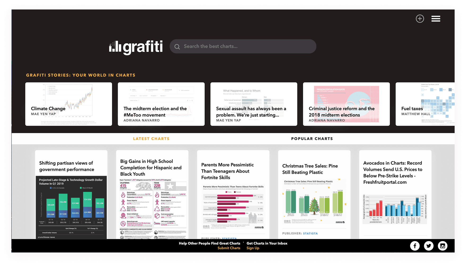
Prioritizing Clarity and Wayfinding on the landing page
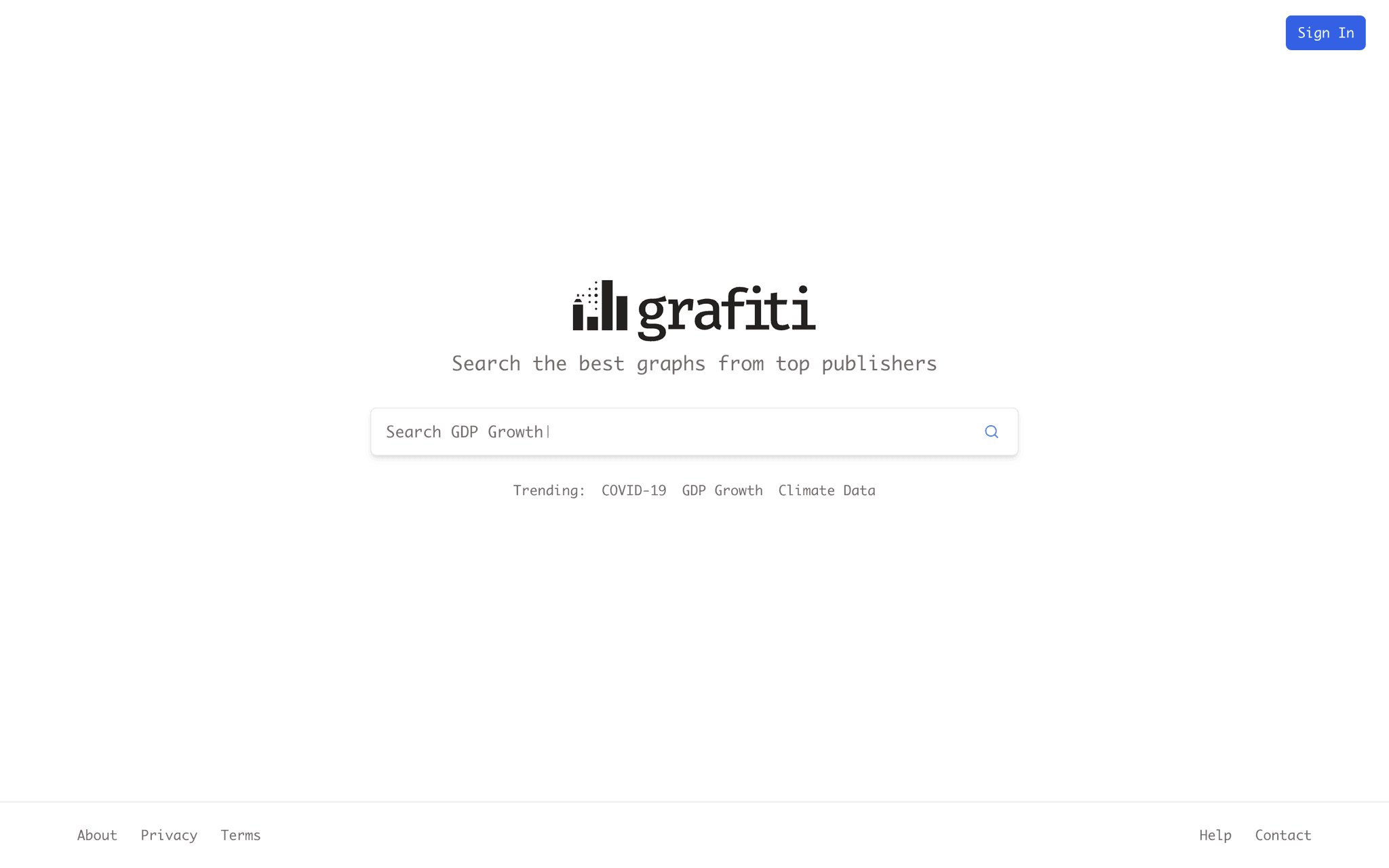
In Grafiti v1, we noticed that new visitors often arrived on the homepage without a clear understanding of what the tool was for or how to begin. There was too much ambiguity around purpose, which led to confusion and drop-offs. For v2, we focused on making the search function unambiguous and central, both visually and conceptually. Click through below to see some of the changes and the design rationale behind them.
Back
<-
Next
->
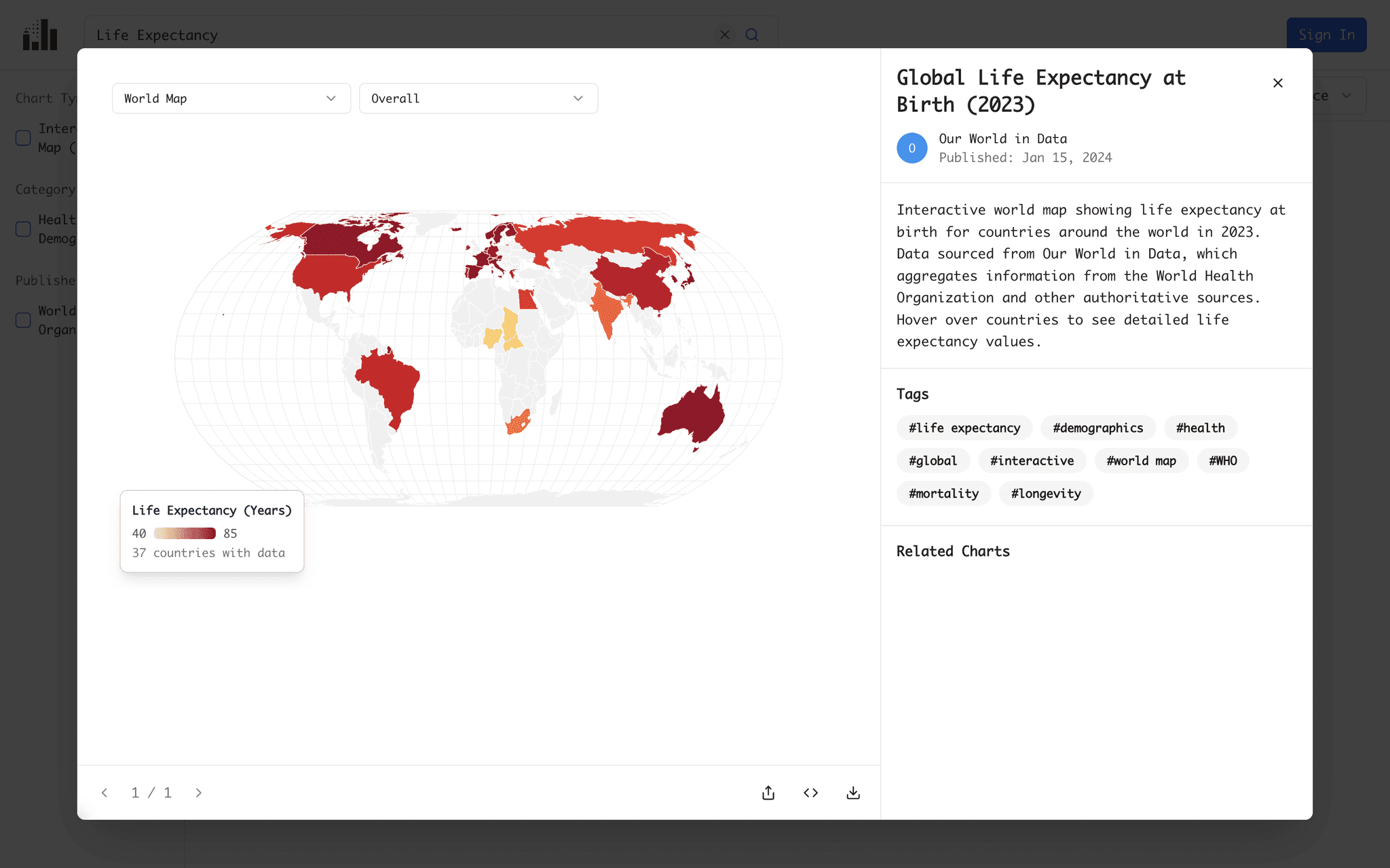
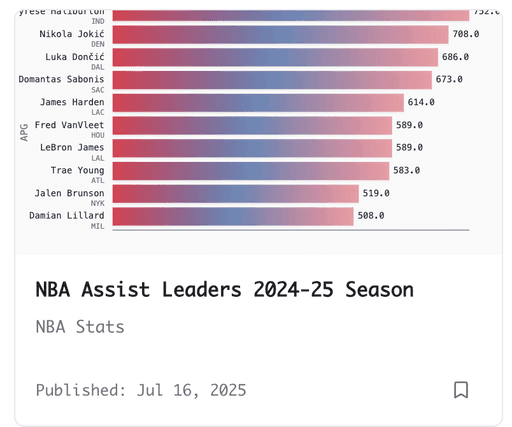
Creating the chart card was one of the more nuanced challenges of this project. Each card needed to communicate a dense amount of metadata: title, source, date, verification status, and relevance, without overwhelming the user or compromising visual clarity.
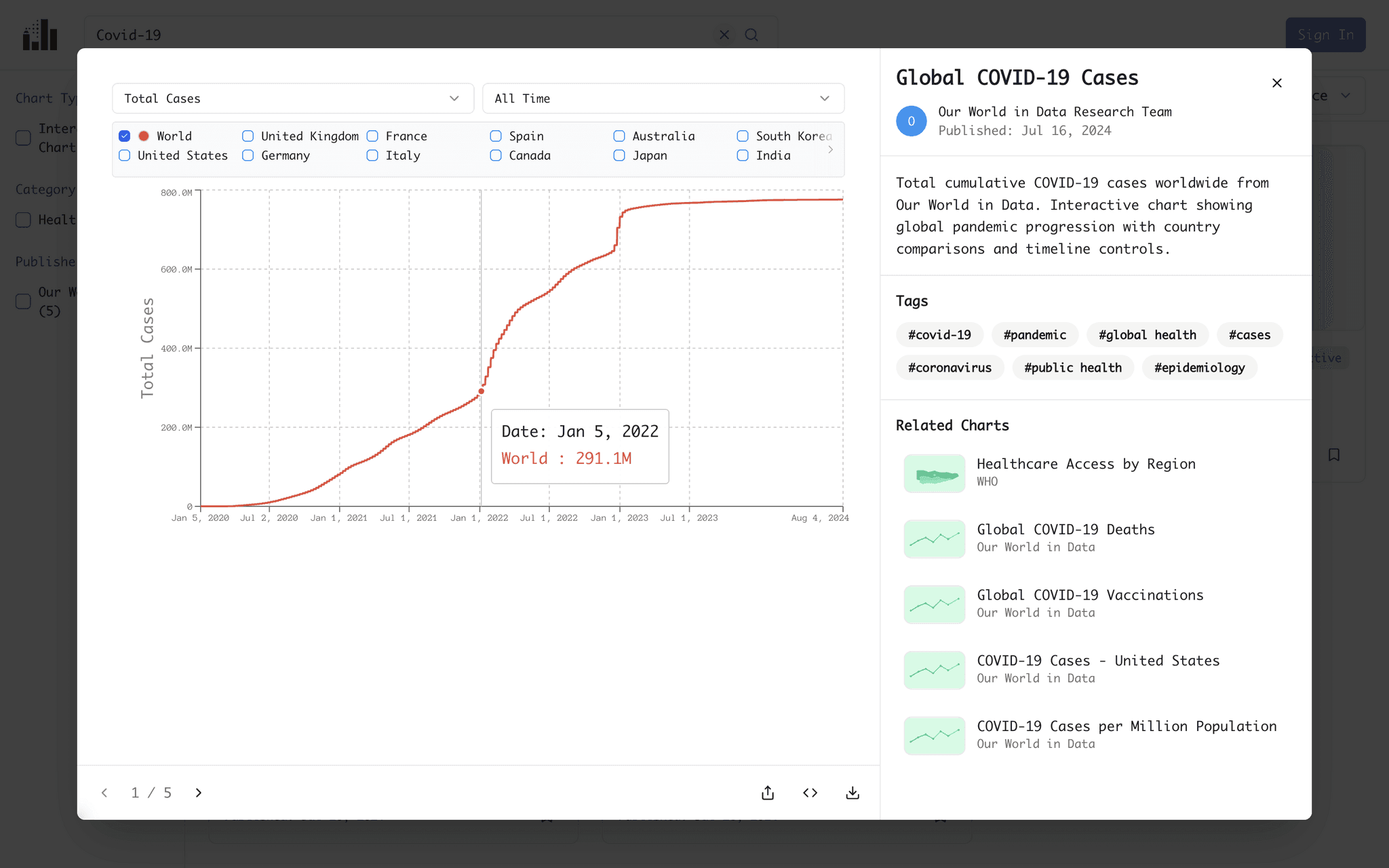
The chart modal is probably the most challenging component to design, for many reasons.
One is that data can be structured in many different ways, which means it can also be expressed and sliced in a variety of ways.
Back
<-
Next
->
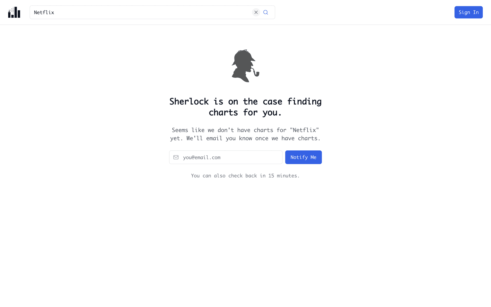
One of the biggest issues in early Grafiti was content scarcity. Many user searches returned no results, leading to drop-offs and user frustration. To address this, I collaborated with one of our engineers to design Sherlock, a Python script that triggered a web scrape job whenever a search yielded fewer than three results.
Back
<-
Next
->