TIMELINE

6 MONTHS

CLIENT:

GRAFITI

YEAR:

2020

ROLE:

PRODUCT DESIGN, USER RESEARCH

Grafiti

Grafiti

TL;DR
TL;DR

Grafiti was a chart search engine aimed at making data more accessible by curating visualizations from credible sources. As co-founder and lead product designer, I designed the platform from the ground up: conducting user research, setting up IA, to interaction design and running usability tests. The biggest challenge was balancing openness with credibility and helping users navigate sparse or unfamiliar content. I led a product redesign that focused on improving clarity, context, and wayfinding, ultimately growing the product to over 30K monthly active users before we sunset due to funding constraints. This project taught me the critical difference between building for users and designing for customers.

Context
Context

Grafiti had built a chart search engine in its mission to put data in the hands of as many people as possible, in a format that they can easily understand. But as the number of visitors to the site increased, we uncovered some inefficiencies in its usability that was impacting its ability to retain users.

I led user research, end-to-end product design, usability testing, and collaborated with a product manager and 6 engineers during this project.

Redesign Results

31% decrease in bounce rates

2% increase in avg time spent on site

50% increase in user retention rates

30K MAU

Redesign Results

31% decrease in bounce rates

2% increase in avg time spent on site

50% increase in user retention rates

30K MAU

Problem
Problem

Grafiti faced retention challenges due to usability issues and unclear messaging.


While v1 aimed to be a chart engine for everyone, the lack of focus left users uncertain about the product’s purpose and audience. For v2, we prioritized sharpening the tool’s utility and clarifying its value proposition to better resonate with our target users.

Grafiti faced retention challenges due to usability issues and unclear messaging.

While v1 aimed to be a chart engine for everyone, the lack of focus left users uncertain about the product’s purpose and audience. For v2, we prioritized sharpening the tool’s utility and clarifying its value proposition to better resonate with our target users.

Version 1 of Grafiti, born out of a weekend hackathon.

Version 1 of Grafiti, born out of a weekend hackathon.

Understanding our Current Users Better

To better understand how users were engaging with Grafiti, we began by auditing current usage patterns. We combined behavioral data from Hotjar with traffic insights from Google Analytics, and layered on qualitative feedback through a user survey, one-on-one interviews, and usability testing with repeat users. Our goal was to uncover not just what users were doing, but why.


“Like a Pinterest for Charts”
Some users saw Grafiti as a source of visual inspiration rather than a utility, describing it as “Pinterest for charts.” They valued browsing visualizations from major publishers to spark new story ideas or discover novel ways of presenting data.


Tension Between Openness and Credibility
The platform’s open contribution model raised questions around trust and authority. While some appreciated accessibility, others hesitated due to the lack of editorial oversight. This prompted us to reflect on our core identity: Should Grafiti be an open platform for all, or a curated space that prioritizes credibility?


Broken Wayfinding & Dead Ends
Many users hit dead ends, either landing on empty search results or failing to locate the search bar altogether. These moments of friction led to premature drop-offs and revealed critical gaps in navigation and information architecture.


Interest from Publishers, But Workflow Friction
Smaller organizations expressed interest in having their content featured on Grafiti, but were reluctant to take on the manual burden of uploading. This highlighted a need to better integrate with existing publisher workflows if we wanted to scale high-quality content.


These insights were both humbling and energizing. While users found value in the core idea, the research made it clear: we didn’t have a product problem, we had an execution and clarity problem. That realization became the foundation for how we approached the redesign.

To better understand how users were engaging with Grafiti, we began by auditing current usage patterns. We combined behavioral data from Hotjar with traffic insights from Google Analytics, and layered on qualitative feedback through a user survey, one-on-one interviews, and usability testing with repeat users. Our goal was to uncover not just what users were doing, but why.

“Like a Pinterest for Charts”
Some users saw Grafiti as a source of visual inspiration rather than a utility, describing it as “Pinterest for charts.” They valued browsing visualizations from major publishers to spark new story ideas or discover novel ways of presenting data.

Tension Between Openness and Credibility
The platform’s open contribution model raised questions around trust and authority. While some appreciated accessibility, others hesitated due to the lack of editorial oversight. This prompted us to reflect on our core identity: Should Grafiti be an open platform for all, or a curated space that prioritizes credibility?

Broken Wayfinding & Dead Ends
Many users hit dead ends, either landing on empty search results or failing to locate the search bar altogether. These moments of friction led to premature drop-offs and revealed critical gaps in navigation and information architecture.

Interest from Publishers, But Workflow Friction
Smaller organizations expressed interest in having their content featured on Grafiti, but were reluctant to take on the manual burden of uploading. This highlighted a need to better integrate with existing publisher workflows if we wanted to scale high-quality content.

These insights were both humbling and energizing. While users found value in the core idea, the research made it clear: we didn’t have a product problem, we had an execution and clarity problem. That realization became the foundation for how we approached the redesign.

Personas
Personas

We synthesized insights from our interviews into two primary personas to clarify who we were designing for and what they needed from the product. The first was the Data Journalist, seeking fresh angles and visual references for timely stories. The second, the On-the-Go Analyst, needed a fast, lightweight way to surface trends and extract insights with minimal friction. These personas helped anchor our design decisions around real user goals and behaviors.

We synthesized insights from our interviews into two primary personas to clarify who we were designing for and what they needed from the product. The first was the Data Journalist, seeking fresh angles and visual references for timely stories. The second, the On-the-Go Analyst, needed a fast, lightweight way to surface trends and extract insights with minimal friction. These personas helped anchor our design decisions around real user goals and behaviors.

Personas

We synthesized insights from our interviews into two primary personas to clarify who we were designing for and what they needed from the product. The first was the Data Journalist, seeking fresh angles and visual references for timely stories. The second, the On-the-Go Analyst, needed a fast, lightweight way to surface trends and extract insights with minimal friction. These personas helped anchor our design decisions around real user goals and behaviors.

Scoping out the Redesign

To align around user needs and business goals, I facilitated a “How Might We…” workshop centered on our key outcomes. We landed on three guiding questions:


  • How might we help Data Journalists explore past coverage across diverse publishers?

  • How might we streamline content consumption to reduce friction?

  • How might we attract and empower publishers to contribute content?


From these prompts, we established core design principles to guide our decision-making:


  • Contextualization – Prioritize clarity without oversimplifying; great charts inform without losing nuance.

  • Clarity – Help users navigate with confidence and reduce the risk of dead ends.

  • Balance – Maintain platform openness while presenting information in a way that builds credibility and trust.

  • Transparency – Be upfront about our sources and processes; honesty fosters forgiveness and long-term trust.

These principles helped ensure our redesign was rooted not just in usability, but in values that resonated with both our users and our mission.

To align around user needs and business goals, I facilitated a “How Might We…” workshop centered on our key outcomes. We landed on three guiding questions:

  • How might we help Data Journalists explore past coverage across diverse publishers?

  • How might we streamline content consumption to reduce friction?

  • How might we attract and empower publishers to contribute content?

From these prompts, we established core design principles to guide our decision-making:

  • Contextualization – Prioritize clarity without oversimplifying; great charts inform without losing nuance.

  • Clarity – Help users navigate with confidence and reduce the risk of dead ends.

  • Balance – Maintain platform openness while presenting information in a way that builds credibility and trust.

  • Transparency – Be upfront about our sources and processes; honesty fosters forgiveness and long-term trust.

These principles helped ensure our redesign was rooted not just in usability, but in values that resonated with both our users and our mission.

Wireframing & Prototyping

The next challenge was to weave these design principles and ideas into a cohesive product experience that achieve the key outcomes we expect for our personas.

Below are some sketches and early prototypes of this exploration.

The next challenge was to weave these design principles and ideas into a cohesive product experience that achieve the key outcomes we expect for our personas.

Below are some sketches and early prototypes of this exploration.

Executing the Vision
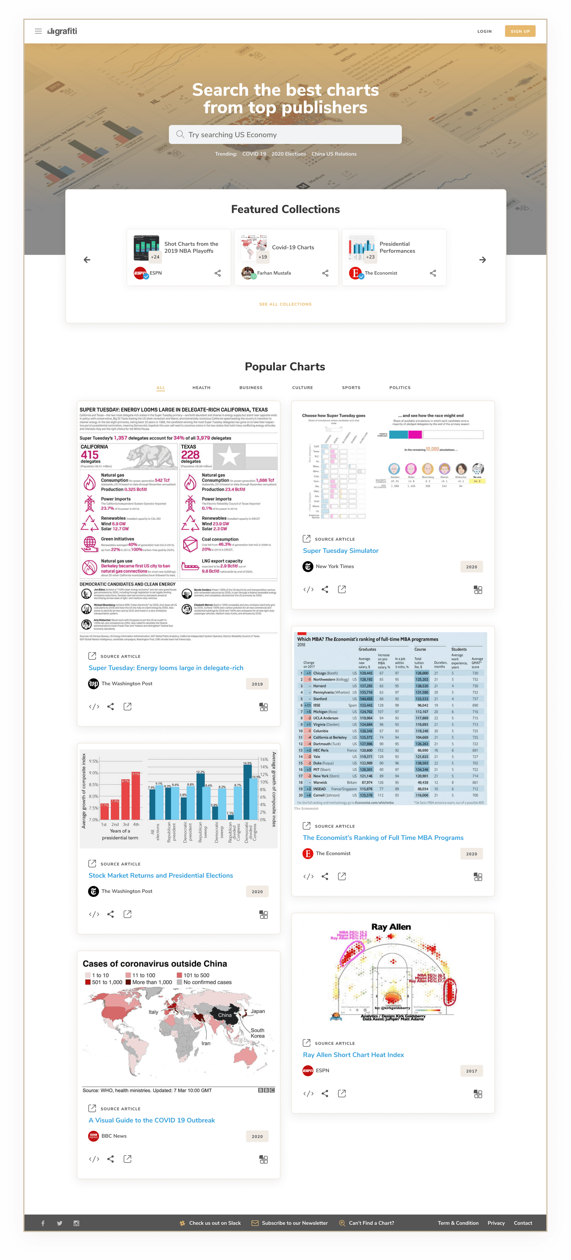
With the goal of making reliable data more accessible, our team built a chart search engine that surfaced visual content from trusted, reputable sources. In a digital landscape crowded with noise and misinformation, we focused on curating high-quality, credible insights in one centralized, easy-to-navigate platform.

Design Language

For the visual design, I wanted to create a style that focused on building trust. This meant prioritizing values like clarity, transparency, and balance. The charts themselves are very visual already, so I needed to balance it out with more subtle elements.

Prioritizing Clarity and Wayfinding

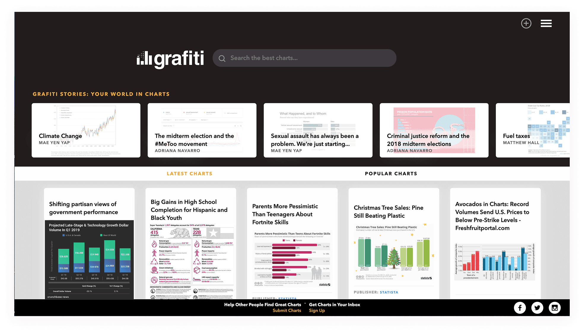
In Grafiti v1, we noticed that new visitors often arrived on the homepage without a clear understanding of what the tool was for or how to begin. There was too much ambiguity around purpose, which led to confusion and drop-offs. For v2, we focused on making the search function unambiguous and central, both visually and conceptually. By giving the search bar prominent placement and supporting it with topical keywords, we aimed to provide a clear entry point and gently guide users toward discovery. I also introduced categorized sections (Health, Sports, Business, Economy, Culture) to give users a sense of the breadth of content available and make browsing more intuitive.

Designing for Clarity Without Clutter

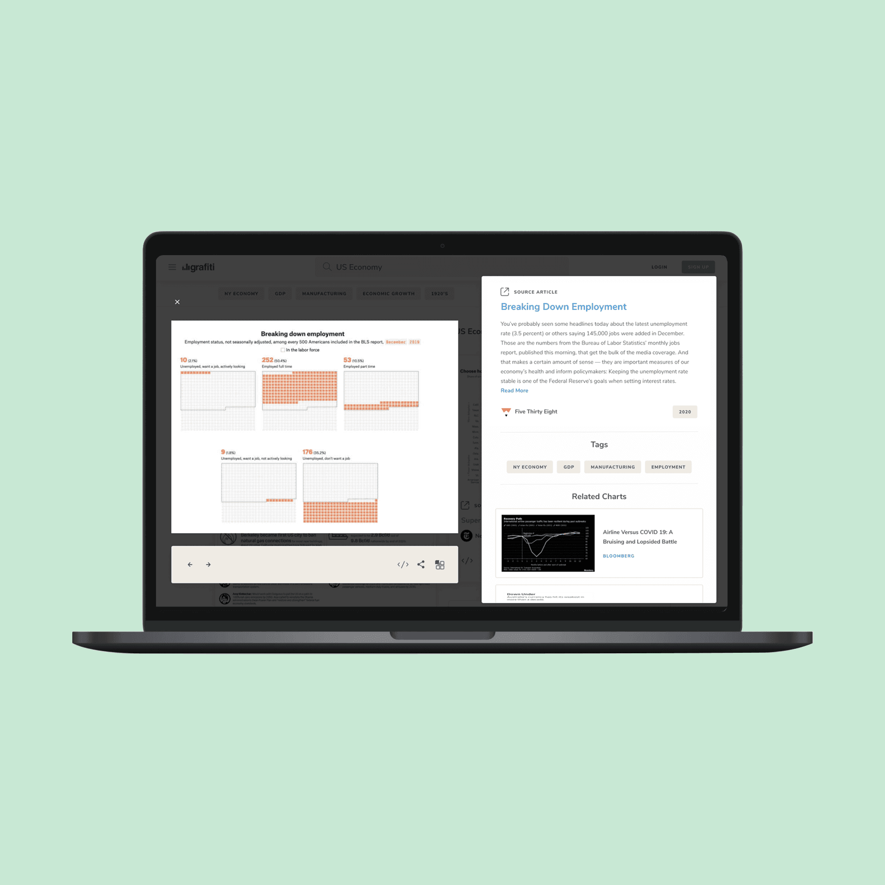
Creating the chart card was one of the more nuanced challenges of this project. Each card needed to communicate a dense amount of metadata: title, source, date, verification status, and relevance, without overwhelming the user or compromising visual clarity. Striking the right balance between clean and informative required careful exploration. One key consideration was how to convey “data freshness,” since recency is often critical when evaluating the relevance of a chart. The following explorations reflect that thinking, as I tested different ways to surface essential information without introducing visual noise.

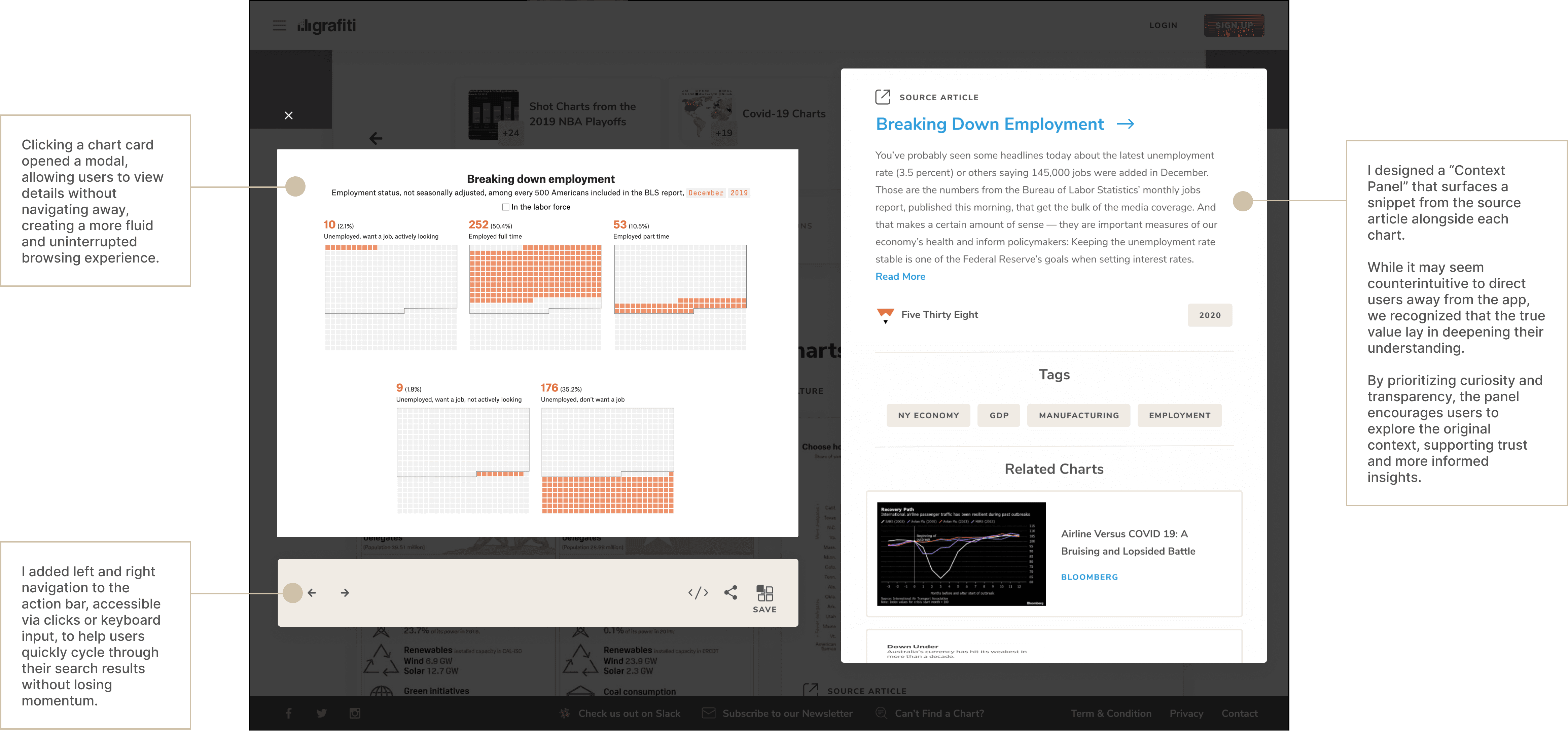
Providing Context and Reducing Friction

While charts are designed to simplify complex information, our research revealed that many users still needed additional context to fully grasp what they were seeing. To bridge that gap, we experimented with displaying the first paragraph from the source article alongside each chart. This small addition led to a 70% increase in click-throughs, suggesting that users were more confident exploring deeper when context was readily available.

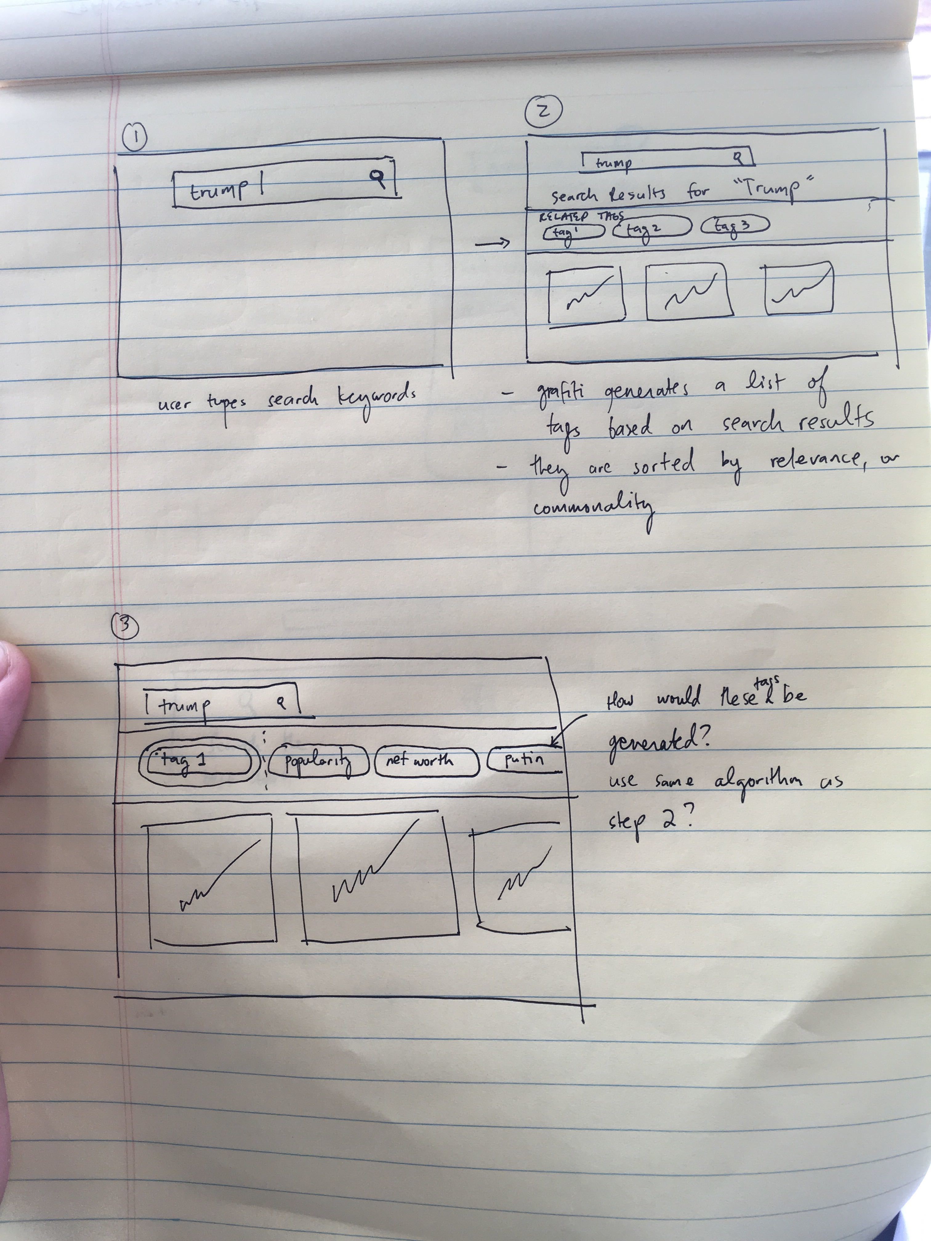
We also noticed a pattern of users refining their queries multiple times, an indication that they weren’t finding what they needed on the first attempt. To better support their discovery journey, we introduced two key features: a Related Charts section to surface adjacent content and a Tags component to help guide search refinement. Both were designed to reduce dead ends and make navigating the platform more intuitive and fluid.

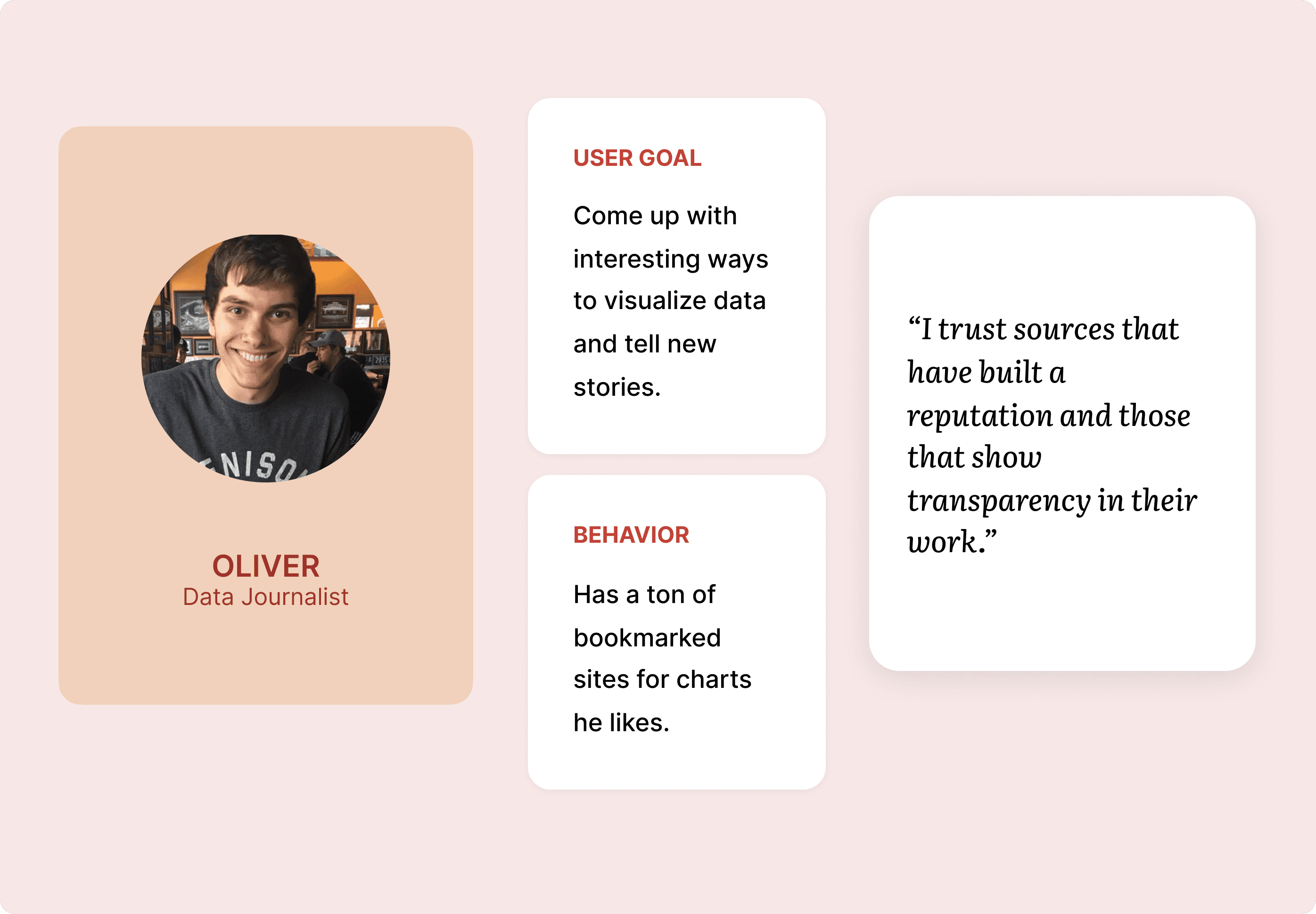
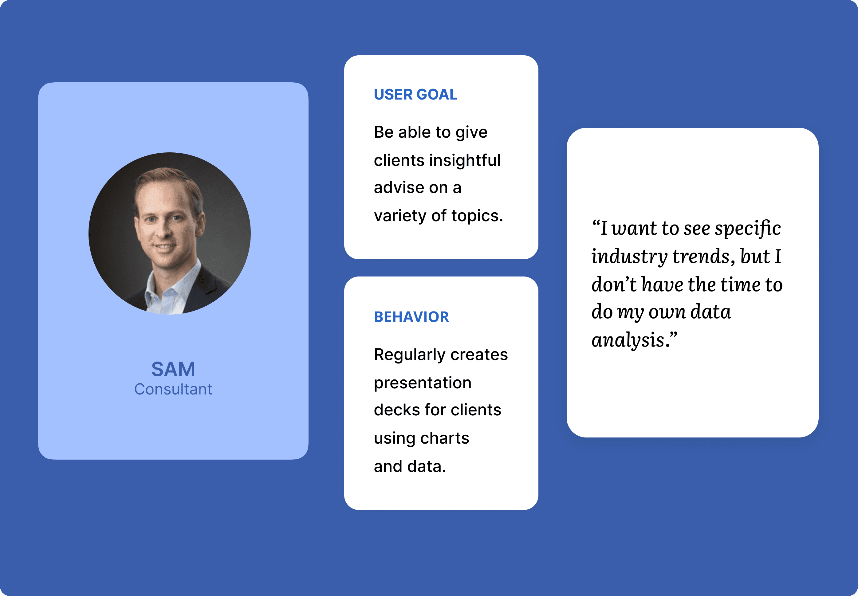
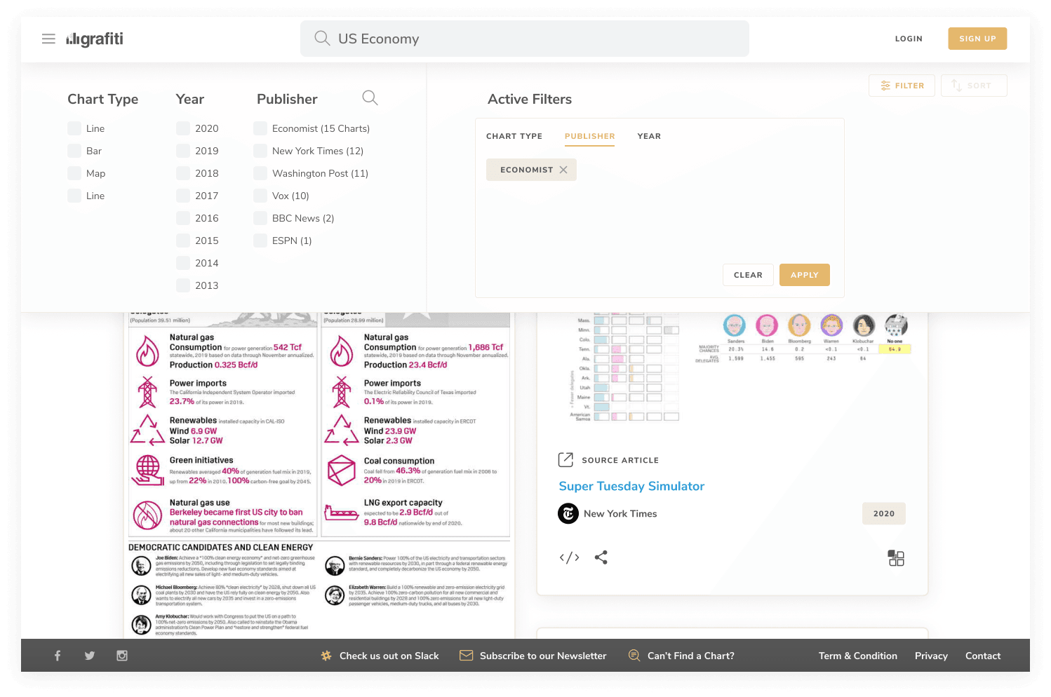
Designing for Diverse Search Behaviors

User habits varied significantly. Data journalists, for instance, often prioritized chart style over topic. To support these distinct needs, we introduced more flexible filtering options, including chart type and publisher. The goal was to give users greater control over their search experience while accommodating different mental models and workflows.

Avoiding Dead Ends Through Smart Scraping

One of the biggest challenges in early Grafiti was content scarcity. Many user searches returned no results, leading to drop-offs and user frustration. To address this, I designed Sherlock, a Python script that triggered a web scrape job whenever a search yielded fewer than three results. These newly sourced charts were then added to the database, improving future search experiences. Users who performed the search could also opt into email alerts to be notified once relevant content was available. This solution not only reduced dead ends, but also allowed us to scale the library based on actual user demand, and retain users who normally would have left for good!

Avoiding Dead Ends Through Smart Scraping

One of the biggest challenges in early Grafiti was content scarcity: many user searches returned no results, leading to drop-offs and user frustration. To address this, we designed Sherlock, a Python script that triggered a web scrape whenever a search yielded fewer than three results. These newly sourced charts were then added to the database, improving future search experiences. Users could also opt into email alerts to be notified once relevant content was available. This solution not only reduced dead ends, but also allowed us to scale the library based on actual user demand, and retain users who normally would have left for good!

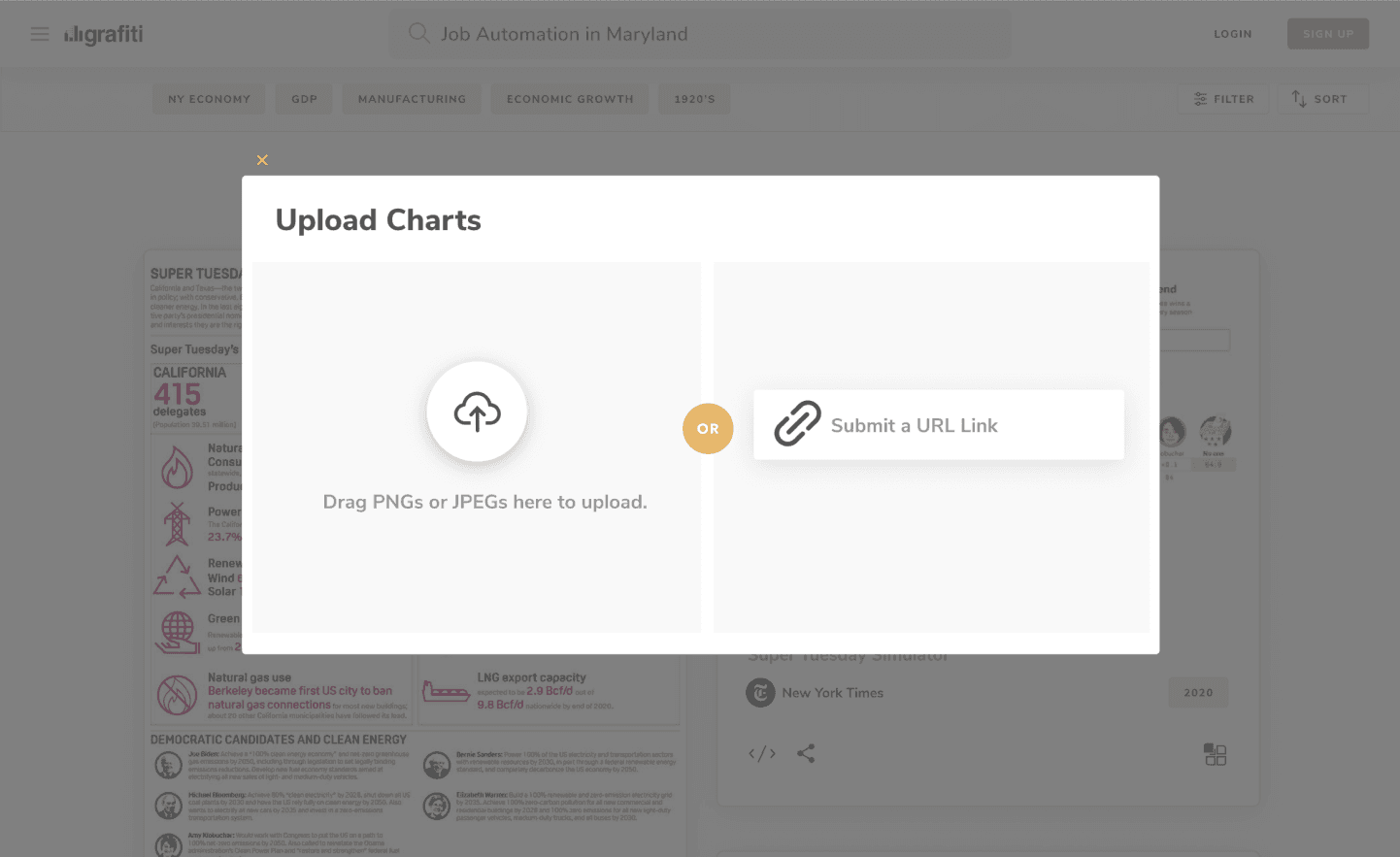
Reducing Publisher Friction with Smarter Upload Tools

While publishers were enthusiastic about sharing their charts, the manual upload process was a major barrier. To streamline this, we introduced two lightweight workflows: a drag-and-drop uploader that used OCR to extract and auto-tag chart images, and a URL-based scraper that let users simply paste a link, automating chart extraction and publishing. These solutions were designed to meet publishers where they were, reducing effort while maintaining content quality and structure.

Comparing the Old and the New

Old

New

Comparing the Old and the New

Old

New

Comparing the Old and the New

Old

New

Responses from our Users

Here are a few notable pieces of praise and feedback after we launched the app:

Here are a few notable pieces of praise and feedback after we launched the app:

Responses from our Users

Here are a few notable pieces of praise and feedback after we launched the app:

Learnings
Learnings

Users Aren’t Always Customers


One of the biggest lessons I took away from Grafiti was understanding the difference between having users and having a viable business. By the time we shut down, we had grown to over 30,000 monthly active users: journalists, analysts, and curious readers who found real value in the tool. But without a sustainable business model or institutional funding, we couldn’t justify the infrastructure costs tied to OCR, cloud services, and ongoing development.


We faced real challenges: a market (newsrooms) that lacked purchasing power, high infrastructure costs (OCR, cloud services), and fundraising headwinds during the pandemic. Despite the traction, we ultimately had to shut the lights off.


Since then, I’ve become much more curious about the business side of product design. Whether I’m joining a company or starting something new, I now ask early questions about sustainability and revenue models. If monetization is part of the goal, I try to consider it from the start, not just as a business concern, but as a design constraint that can meaningfully shape what we build and how we prioritize.

Users Aren’t Always Customers

One of the biggest lessons I took away from Grafiti was understanding the difference between having users and having a viable business. By the time we shut down, we had grown to over 30,000 monthly active users: journalists, analysts, and curious readers who found real value in the tool. But without a sustainable business model or institutional funding, we couldn’t justify the infrastructure costs tied to OCR, cloud services, and ongoing development.

We faced real challenges: a market (newsrooms) that lacked purchasing power, high infrastructure costs (OCR, cloud services), and fundraising headwinds during the pandemic. Despite the traction, we ultimately had to shut the lights off.

Since then, I’ve become much more curious about the business side of product design. Whether I’m joining a company or starting something new, I now ask early questions about sustainability and revenue models. If monetization is part of the goal, I try to consider it from the start, not just as a business concern, but as a design constraint that can meaningfully shape what we build and how we prioritize.

Other Projects
Other Projects
Other Projects