Grafiti

TIMELINE

6 MONTHS

ROLE:

PRODUCT DESIGN, USER RESEARCH

TEAM:

4 ENGINEERS, 1 JR DESIGNER, 1 PM

Grafiti

TIMELINE

6 MONTHS

ROLE:

PRODUCT DESIGN, USER RESEARCH

TEAM:

4 ENGINEERS, 1 JR DESIGNER, 1 PM

Grafiti

TIMELINE

6 MONTHS

ROLE:

PRODUCT DESIGN, USER RESEARCH

TEAM:

4 ENGINEERS, 1 JR DESIGNER, 1 PM

Grafiti

Project Summary
Project Summary

I led a product redesign that focused on improving clarity, context, and wayfinding, ultimately growing the product from 0 to over 30K monthly active users before being sunset due to funding constraints.

Grafiti was a chart search engine aimed at making data more accessible by curating visualizations from open, credible sources. (FRED, BLS, WHO, Our World in Data to name a few.)

As co-founder and lead product designer, I designed the platform from the ground up: from conducting user research, designing the user experience, user interface, setting up design systems, and running usability tests. The biggest challenges were finding harmony between two different design paradigms (a search engine and a data visualization tool) and balancing openness with credibility when helping users navigate sparse or unfamiliar content.

This project taught me the critical difference between designing for users and designing for customers.

Impact
Impact
Impact

30,000

30,000

30,000

30,000

30,000

30,000

MONTHLY ACTIVE USERS

-31%

DECREASE IN BOUNCE RATES

+50%

INCREASE IN RETENTION RATES

Challenge
Challenge

Designing both a search product and a data product.

Grafiti was a challenge to build for many reasons, the main one being that it was building both a search product, and a data visualization tool.
How do we fuse these two paradigms into a cohesive product that meets our users where they are?

The first version of the product was also the result of consensus. (Or maybe lack of conviction to go one direction?) It was trying to be both a search engine, a news source, and a way for its users to showcase their data visualization work. It created kind of a frankenstein of a user experience, which was obvious in the usage data. (High bounce rates, low user retentions rates, avg of 30 second spent on site.)

Designing both a search product and a data product.

Grafiti was a challenge to build for many reasons, the main one being that it was building both a search product, and a data visualization tool. How do we fuse these two paradigms into a cohesive product that meets our users where they are?

The first version of the product was also the result of consensus. (Or maybe lack of conviction to go one direction?) It was trying to be both a search engine, a news source, and a way for its users to showcase their data visualization work. It created kind of a frankenstein of a user experience, which was obvious in the usage data. (High bounce rates, low user retentions rates, avg of 30 second spent on site.)

Version 1 of Grafiti, born out of a weekend hackathon, and a bunch of competing philosohies.

Version 1 of Grafiti, born out of a weekend hackathon, and a bunch of competing philosohies.

Version 1 of Grafiti, born out of a weekend hackathon, and a bunch of competing philosohies.

Understanding our Current Users Better

To better understand how users were engaging with Grafiti, we began by auditing current usage patterns. We combined behavioral data from Hotjar with traffic insights from Google Analytics, and layered on qualitative feedback through a user survey, one-on-one interviews, and usability testing with repeat users. Our goal was to uncover not just what users were doing, but why.

Here are some of the things that we found through our research:

"Like Pinterest for Charts"

Some users saw Grafiti as a source of visual inspiration rather than a utility, describing it as “Pinterest for charts.” They valued browsing visualizations from major publishers to spark new story ideas or discover novel ways of presenting data.

"Like Pinterest for Charts"

Some users saw Grafiti as a source of visual inspiration rather than a utility, describing it as “Pinterest for charts.” They valued browsing visualizations from major publishers to spark new story ideas or discover novel ways of presenting data.

"Like Pinterest for Charts"

Some users saw Grafiti as a source of visual inspiration rather than a utility, describing it as “Pinterest for charts.” They valued browsing visualizations from major publishers to spark new story ideas or discover novel ways of presenting data.

DEAD

END

Broken Wayfinding &

Dead Ends


Many users hit dead ends, either landing on empty search results or failing to locate the search bar altogether. These moments of friction led to premature drop-offs, revealing critical gaps in navigation and information architecture.

Broken Wayfinding &

Dead Ends


Many users hit dead ends, either landing on empty search results or failing to locate the search bar altogether. These moments of friction led to premature drop-offs, revealing critical gaps in navigation and information architecture.

Broken Wayfinding &

Dead Ends


Many users hit dead ends, either landing on empty search results or failing to locate the search bar altogether. These moments of friction led to premature drop-offs, revealing critical gaps in navigation and information architecture.

Tension Between Openness and Credibility

The platform’s open contribution model raised questions around trust and authority. While some appreciated accessibility, others hesitated due to the lack of editorial oversight. This prompted us to reflect on our core identity: Should Grafiti be an open platform for all, or a curated space that prioritizes credibility?

These insights were both humbling and energizing. While users found value in the core idea, the research made it clear: we had a clarity problem. That realization became the foundation for how we approached the redesign.

These insights were both humbling and energizing. While users found value in the core idea, the research made it clear: we had a clarity problem. That realization became the foundation for how we approached the redesign.

Personas
Personas

We synthesized insights from our interviews into two primary personas to clarify who we were designing for and what they needed from the product. The first was the Data Journalist, seeking fresh angles and visual references for timely stories. The second, the On-the-Go Analyst, needed a fast, lightweight way to surface trends and extract insights with minimal friction. These personas helped anchor our design decisions around real user goals and behaviors.

Scoping out the Redesign

To align around user needs and business goals, I facilitated a “How Might We…” workshop centered on our key outcomes. We landed on two guiding questions:

  • How might we help Data Journalists explore past coverage across diverse publishers?

  • How might we streamline content consumption to reduce friction?

From these prompts, we established core design principles to guide our decision-making. These principles helped ensure our redesign was rooted not just in usability, but in values that resonated with both our users and our mission.

Next

->

Back

<-

Contextualization


Prioritize clarity without oversimplifying; great charts inform without losing nuance.

Next

->

Back

<-

Contextualization


Prioritize clarity without oversimplifying; great charts inform without losing nuance.

Next

->

Back

<-

Contextualization


Prioritize clarity without oversimplifying; great charts inform without losing nuance.

Wireframing & Prototyping

The next challenge was to weave these design principles and ideas into a cohesive product experience that achieve the key outcomes we expect for our personas. I always start my process with some sketching and paper prototyping. I find that this allows me to focus on big picture ideas while moving quickly early in the process.


Below are some sketches and early prototypes of this exploration.

Executing the Vision

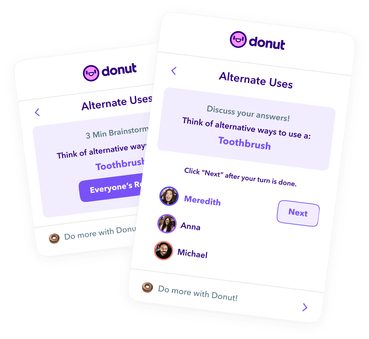
With the goal of making reliable data more accessible, our team built a chart search engine that surfaced visual content from trusted, reputable sources. In a digital landscape crowded with noise and misinformation, we focused on curating high-quality, credible insights in one centralized, easy-to-navigate platform.

Main Font

Main Font

Main Font

SF Mono

SF Mono

SF Mono

AaBb

AaBb

AaBb

From chaotic to clear—the design change that reduced bounce rates by 31%

From chaotic to clear—the design change that reduced bounce rates by 31%

From chaotic to clear—the design change that reduced bounce rates by 31%

Scroll

Scroll

Scroll

Scroll

Creating the chart card was one of the more nuanced challenges of this project. Each card needed to communicate a dense amount of metadata: title, source, date, verification status, and relevance, without overwhelming the user or compromising visual clarity.

Creating the chart card was one of the more nuanced challenges of this project. Each card needed to communicate a dense amount of metadata: title, source, date, verification status, and relevance, without overwhelming the user or compromising visual clarity.

Creating the chart card was one of the more nuanced challenges of this project. Each card needed to communicate a dense amount of metadata: title, source, date, verification status, and relevance, without overwhelming the user or compromising visual clarity.

Scroll

Scroll

Scroll

The chart modal is probably the most challenging component to design, for many reasons.

One is that data can be structured in many different ways, which means it can also be expressed and sliced in a variety of ways.

First thing, though. Why a modal instead of a page? The answer is pretty simple: sorting through charts is just faster this way, compared to using the browser controls and waiting for page loads/refreshes going through charts.

Scroll

Scroll

Scroll

One of the biggest issues in early Grafiti was content scarcity. Many user searches returned no results, leading to drop-offs and user frustration. To address this, I collaborated with one of our engineers to design Sherlock, a Python script that triggered a web scrape job whenever a search yielded fewer than three results.

These newly sourced charts were then added to the database, improving future search experiences. Users who performed the search could also opt into email alerts to be notified once relevant content was available.

Scroll

Scroll

Scroll

Post Launch
Post Launch

This design helped us grow our userbase to the tune of 30K MAU, helped us raise a 1M dollar seed round, and get into Tech Stars NY (which we declined)

Shortly after raising that round, our team decided to pivot into building a B2B search tool to chase profitability using the same Grafiti search technology.

Here are a few notable pieces of praise and feedback after we launched the redesign:

Learnings
Reflections

Users Aren’t Always Customers

One of the biggest lessons I took away from Grafiti was understanding the difference between having users and having a viable business. By the time we shut down, we had grown to over 30,000 monthly active users: journalists, analysts, and curious readers who found real value in the tool. But without a sustainable business model or institutional funding, we couldn’t justify the infrastructure costs tied to OCR, cloud services, and ongoing development.

We faced real challenges: a market (newsrooms) that lacked purchasing power, high infrastructure costs (OCR, cloud services), and fundraising headwinds during the pandemic. Despite the traction, we ultimately had to shut the lights off.

Since then, I’ve become much more curious about the business side of product design. Whether I’m joining a company or starting something new, I now ask early questions about sustainability and revenue models. If monetization is part of the goal, I try to consider it from the start, not just as a business concern, but as a design constraint that can meaningfully shape what we build and how we prioritize.