INDUSTRY:
TOOLS
CLIENT:
PIXEL PERFECT
YEAR:
2022
EXPERIENCE:
MOCKUPS
Trip Tip
about.
Visual Screen Models is designed for creators who need high-quality, realistic displays for presenting their work. Mockups of devices like MacBooks, smartphones, tablets, and other digital products were crafted with maximum flexibility and realism in mind. Each mockup allows users to effortlessly upload their own designs or app visuals, enabling them to showcase their work in a professional context. This project aims to provide artists and businesses with a tool that helps them present digital products effectively and attractively.
challenge.
The main challenge was to create mockups that would be not only visually appealing but also user-friendly and adaptable for various graphic styles. Each mockup needed to look realistic, accurately displaying designs without distortion or loss of quality. Perfecting light and screen reflections, so they enhanced rather than obscured the displayed content, was also essential. Creating an intuitive, easy-to-use system for users to customize their mockups was a core focus throughout the project.
User Research Methods
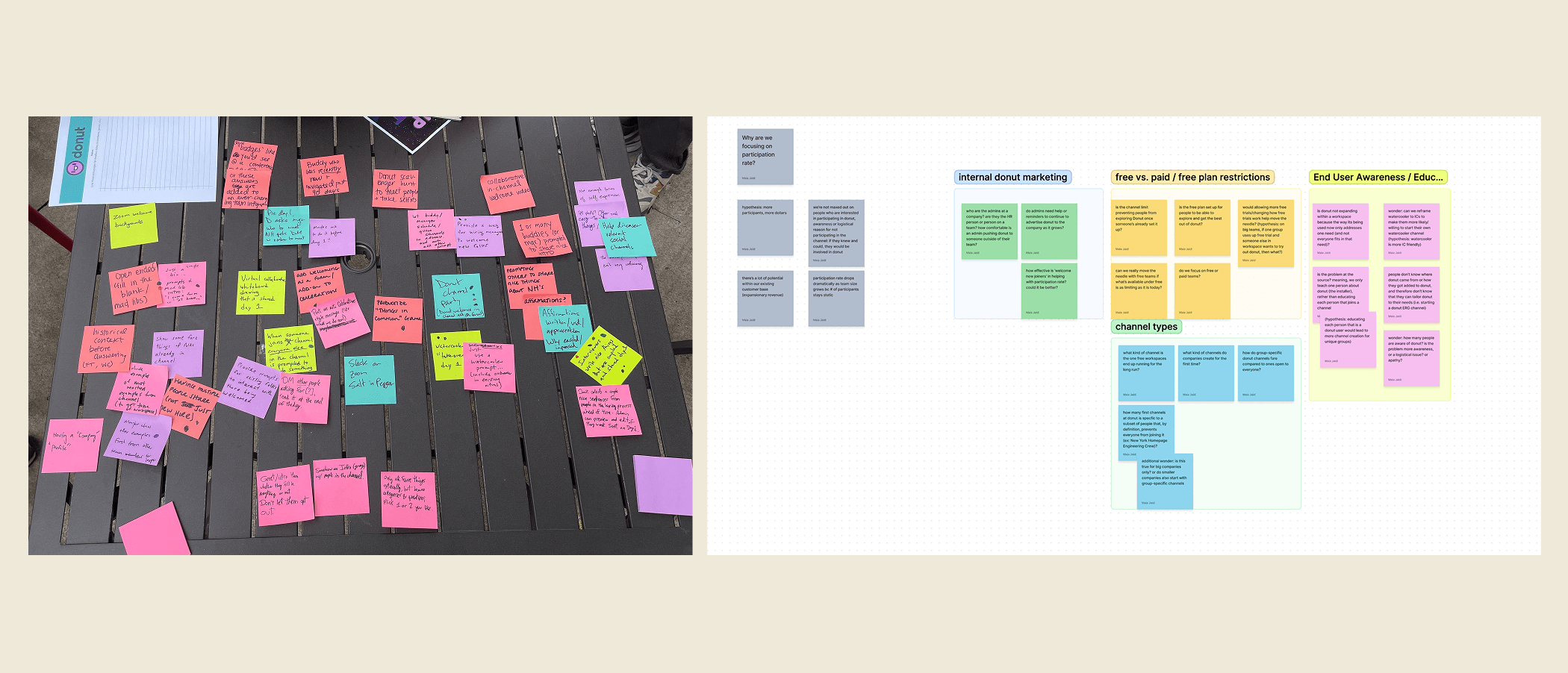
After some deliberation, my team and I reached a consensus to perform a tandem series of qualitative interviews and usability tests. The map below illustrates a simplified version of the strategy employed in uncovering the answer to the aforementioned questions.

Challenge
Recruiting Interviewees
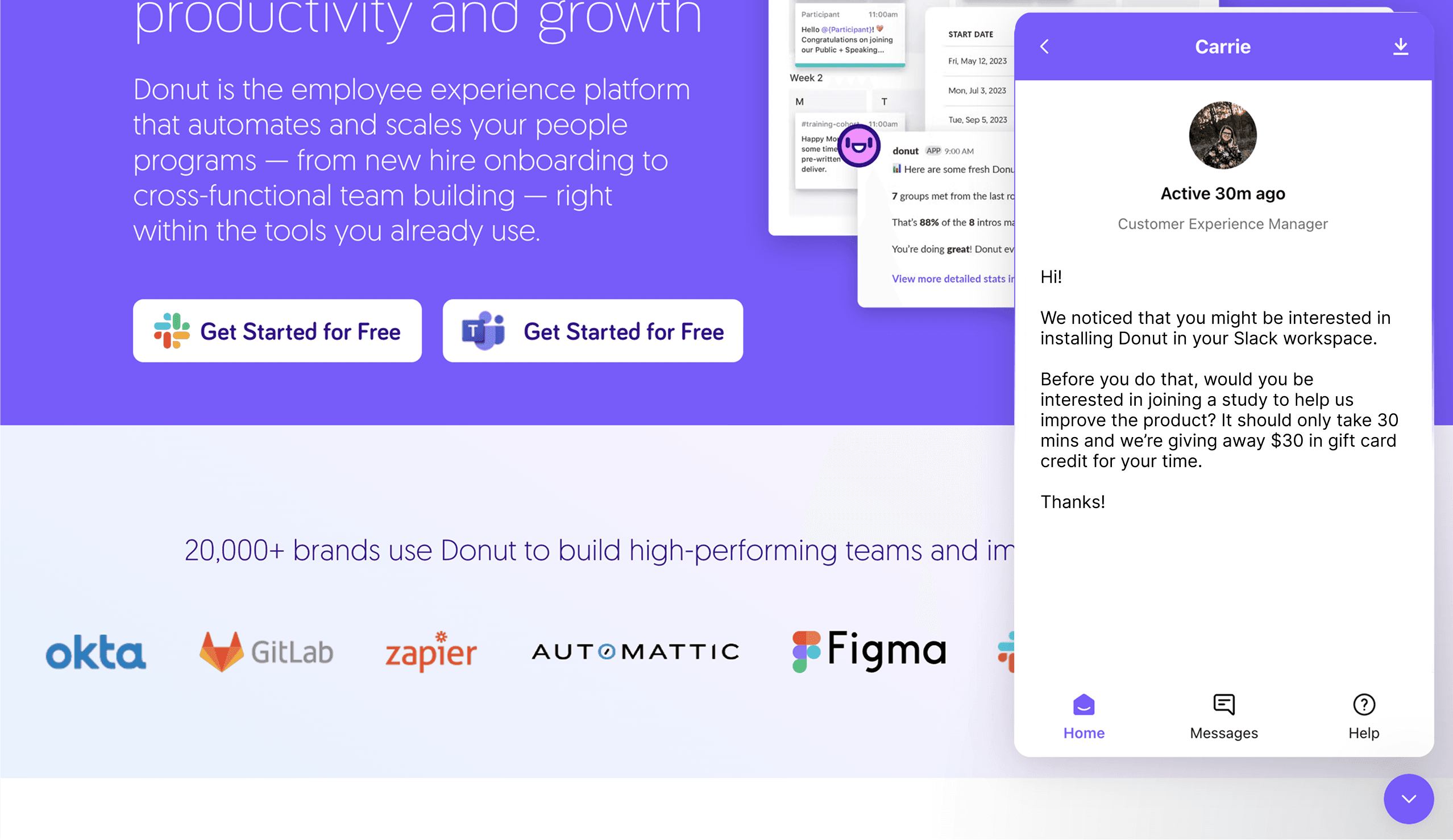
Intercepting at installation
To find the right test candidates, we emailed current Donut admins a screener survey that only put people through if they self-reported installing Donut in their Slack workspace. We then offered them financial incentives for participating in our research project.
For the usability test, it was imperative for us to observe how first time users were navigating the current design to understand why they were only installing one product.
Making sure that they were first time users was a key to this part of the exercise, and it was a challenge thinking of ways to capture the right people.
Thankfully, we were able to identify first time visitors via Intercom, and if they initiated the installation flow, we’d intercept them via Intercom’s chat feature, asking them to forgo installation and to participate in a usability study in exchange for financial incentives.
This method proved effective as we got a number of participants interested in this way.
Discovery + Deeper Insights
After a total of 20 interviews and 15 usability tests, our team started getting an idea on the relationship between multi product use and customer conversion.
Different people seek different modes of connection
Teams that have been using Donut for a while often say that one product may not be a fit for them but a different one is.
Intros is a better fit for more extroverted people who prefer video calls while Watercooler is a better fit for more introverted folks who preferred to chat. And because of the business model (Per user per month) having more people in a Slack workspace is what puts them over the free tier limit, converting them into paid accounts.
Having multiple Donut products installed in one workspace increases the surface area to capture more billable users. This seemed to answer one of our key business questions regarding the relationship between multi product use and customer conversion.
A lot of people didn’t know everything Donut had to offer!
It was truly surprising to find out that most people who used Donut only know about one product. As part of the interviews, we showed participants a page that listed all of Donut’s product offerings and to our surprise, many of them said that they had never seen that page before. This was a likely reason why 80% of our users were not paying.
10% of teams that try a paid product end up converting into customers
From this, the question became: how do we increase user exposure to these products?
There's a lot of value in automation
There are also people whose jobs it is to improve company culture and found that Donut automates tedious manual tasks that would normally take them hours to do per work week and for them, which makes it a no-brainer for them to pay for Donut.
Usability Study Findings
The second goal of the research was to understand why 80% of our users were not using more than one Donut product.
After auditing Donut’s current onboarding flow, I hypothesized that the issue had something to do with the current onboarding flow and how it failed at communicating Donut’s full set of capabilities. I conducted a usability study, recruiting first time users who intended to install Donut in their workspace to see how they would navigate the website.
Below are some of the key usability issues that I suspected affected completion rates:
Hypothesis
We hypothesized that if we can inform a user about ALL of Donut’s best offerings from the beginning while creating an installation experience that balances intuitiveness with clarity, we’d increase the chances of multiple product installs per team, and therefore increase chances of customer conversion.
We now have 2 new guiding insights:
1. That different people prefer different modes of connecting with their company, and
2. That first time installers aren’t fully aware of Donut’s full suite of offerings.
Ideation
With these insights and new hypothesis, I, along with some PMs, led a design workshop with a goal of redesigning Donut’s onboarding experience.
We felt that it was important to get a variety of perspectives so we made sure to invite members from different departments to participate.
I reframed the problem into a how might we statement: “How Might We get teams to install multiple Donut products during onboarding?” and facilitated a design workshop to gather some perspectives and ideas. (One of the exercises asked participants to sketch some solutions to the problem statement.)
We then voted on ideas we felt were interesting and/or viable. We did not necessarily go with the idea with the most votes, but going through this exercise gave us a sense for what directions got the team excited.
Design Imperatives
Guided by the usability study findings and by insights from user interviews, I came up with some design imperatives that aimed to improve upon the current design’s issues, with the goal of testing our hypothesis that teams who use more Donut products are more likely to convert to being customers vs those who only use one.
The imperatives were:
Demonstrate the product’s value as early as possible.
Showcase the product’s array of capabilities and clarify value to entice users to install multiple products as early as possible.
Reduce reliance on Slack DMs, which are often ignored or forgotten.
Automate what can be automated to expedite the set up process.
Clarity over simplicity
Do all these while retaining the ease of installation that the original design had
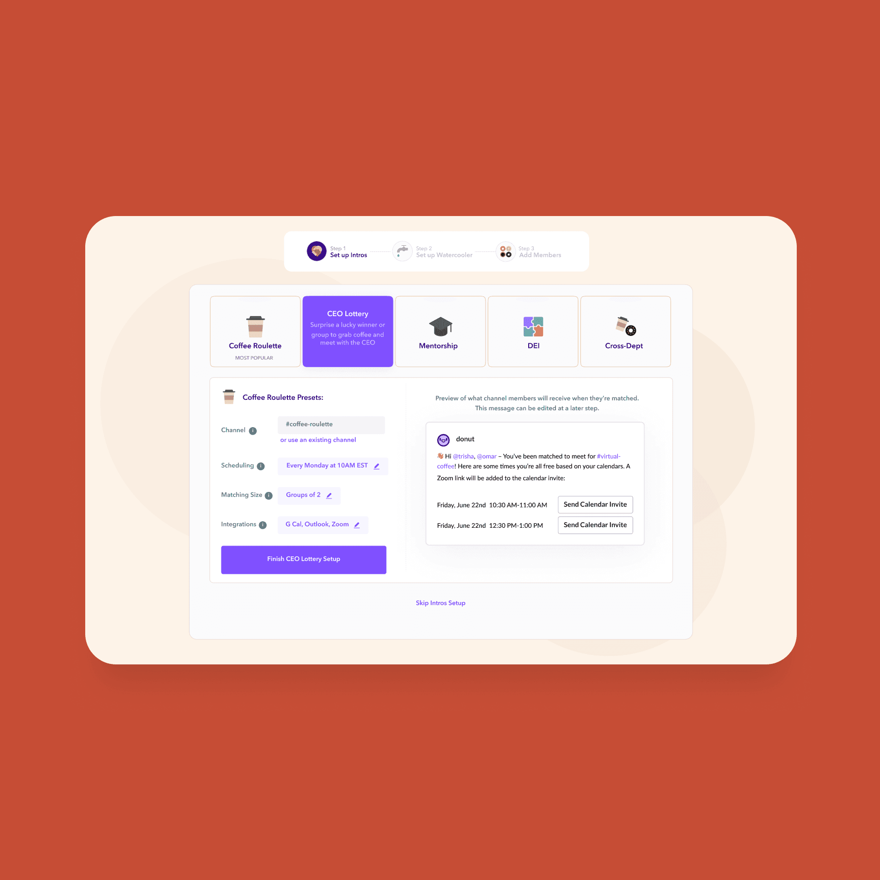
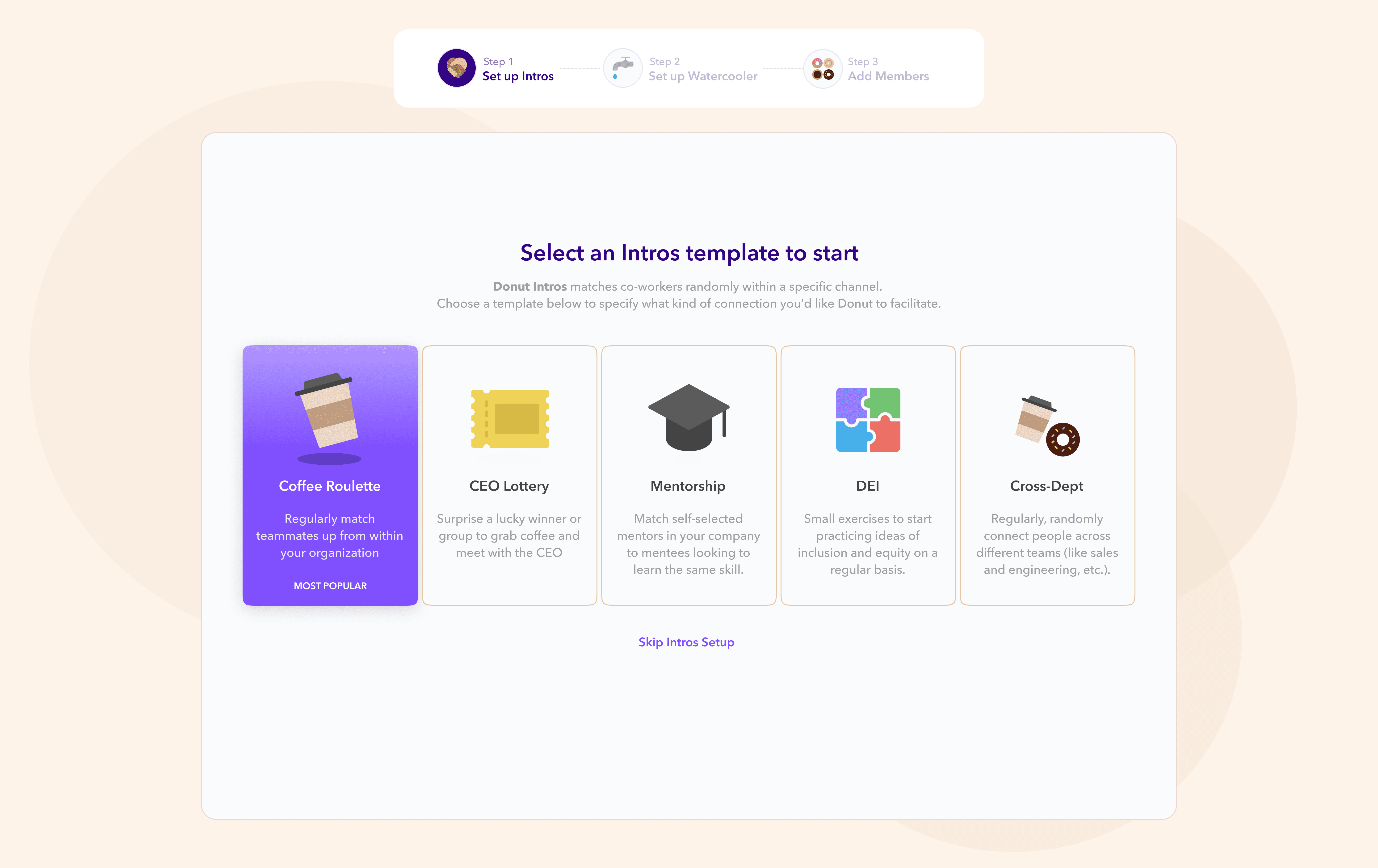
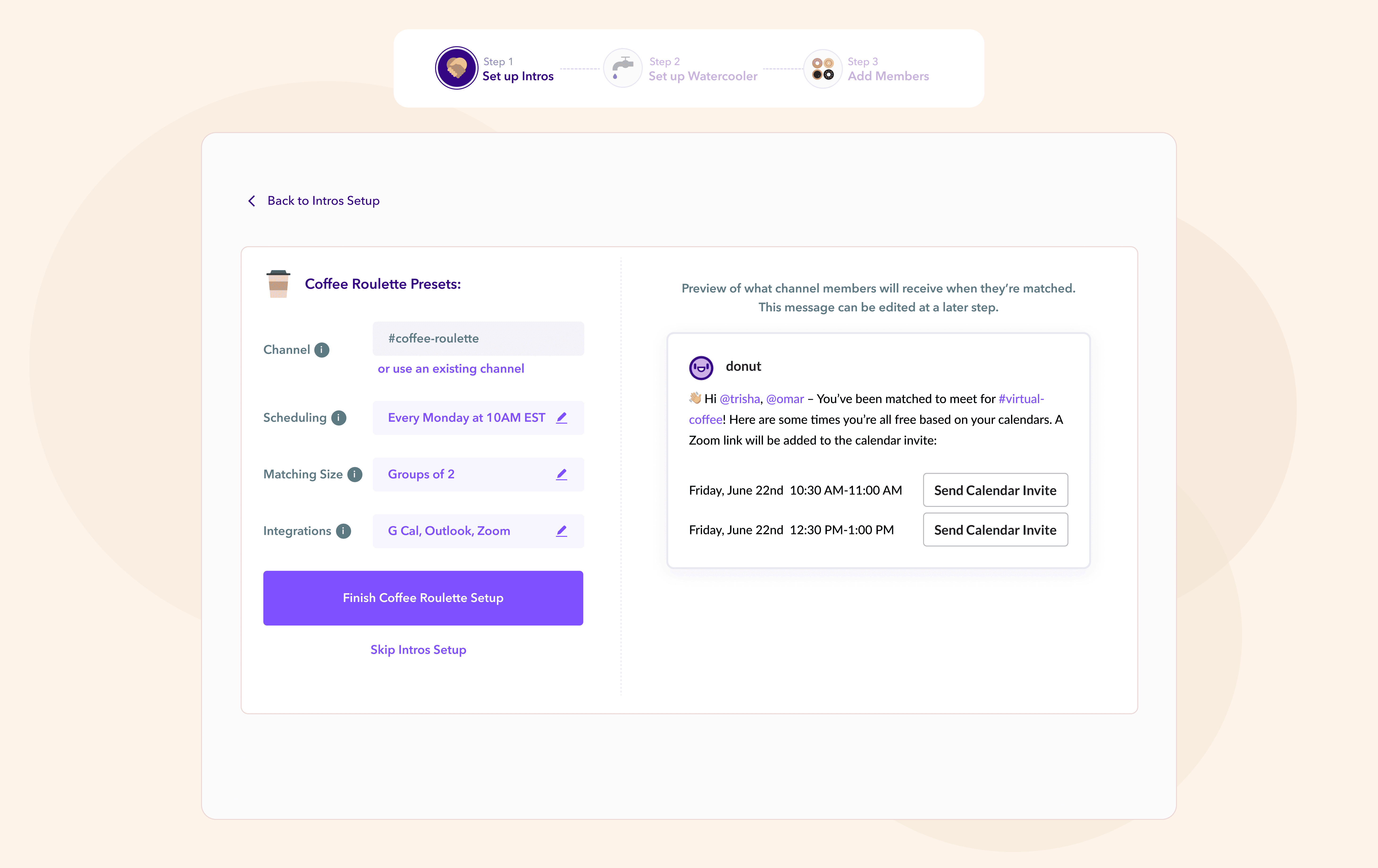
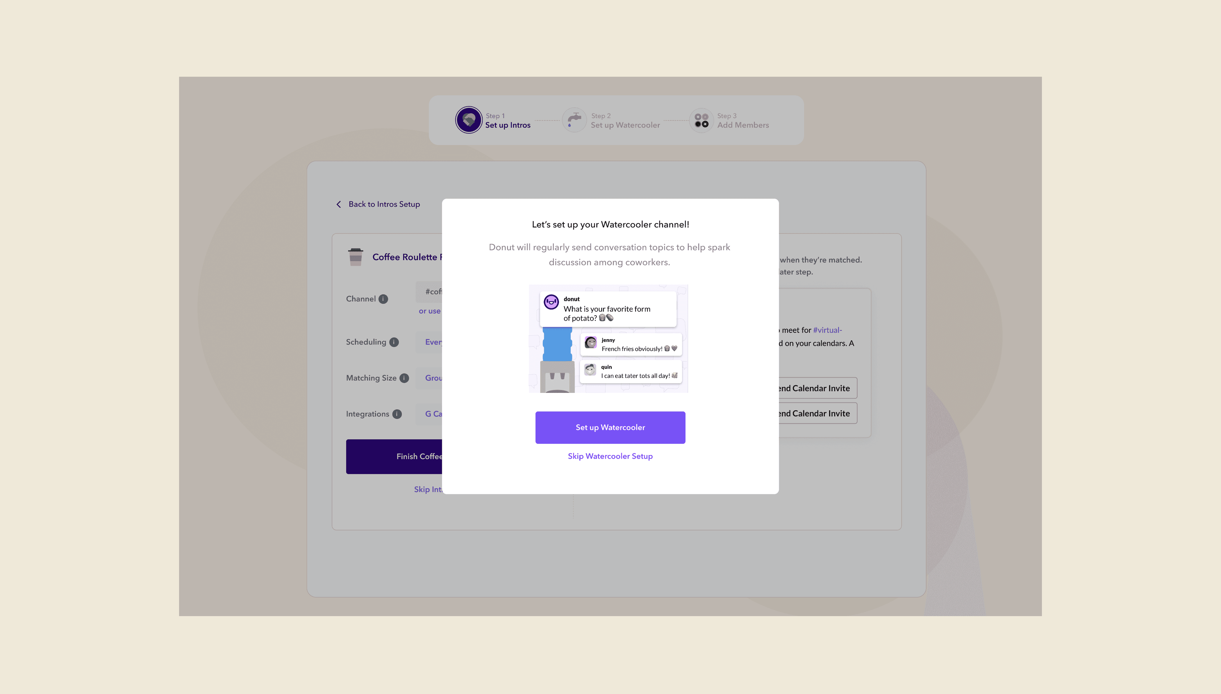
Sign Up Flow Redesign
The idea was to show an installer all the different Donut products in one onboarding flow, rather than relying on follow up DMs and running the risk of the message being ignored/forgotten.
We also showed some of Donut’s paid templates early on to accelerate the conversion to paid tiers. (This put the installing team in a 2-week trial period much earlier in their customer journey. Some of Donut’s more magical moments resided in these paid templates, so the idea was to get them to that AHA moment faster.)
Old Design: Restrictive
New Design: Expansive
2
3
1
Old Design: Lengthy and Overwhelming
New Design: Straight to the Point
4
Old Design: Disjointed, forgettable
New Design: Streamlined
New Design in Action
Derisking Implementation
Our team understood that implementing a radical redesign project like this can be risky, despite a high level of confidence in the new design due to good usability test results and support from the rest of the company.
To mitigate risk, we decided to conduct an A/B test to compare the new design’s efficacy against the current one’s, tracking key metrics like:
• Number of products installed per session
• Trial starts
• Conversion to being paid customers
Results:
The Visual Screen Models simplified our work, adding professionalism and realism to our presentations. Perfect for elevating any portfolio.
Learnings
The success of this project was due to spending more time truly understanding the problem. It was easy to jump into solutions upon the discovery of initial insights. Investing more time interviewing users and conducting usability tests were crucial in identifying deeper insights, which made the actual solution finding much easier.
Cross-functional collaboration helped in reducing our blind spots in this project. It was through multiple conversations with our data scientist and customer success teams, and treating them as design partners that we were able to gain multiple perspectives that led to the success of this project.